 Palette and color-chart
To mix my acrylic colors as I want, I must have a basic and well balanced set of pigments, and I must know what will happen when I mix them together. So, during a long weekend, I decided to paint a color-chart for better understanding and mastering colors. I first defined my palette with twelve colors:
| name | pigment | winsor-newton |
|---|---|---|
| magenta quinacridone | PR122 | 550 |
| red cadium | PR108 | 99 |
| sienne brunt | PR101 | 74 |
| Umber raw | PBr7 | 557 |
| Ocre | PY43 | 744 |
| yellow cadium medium | PY35 | 116 |
| yellow Hansa | PY3 | 346 |
| green phthalo | PG36 | 521 |
| blue cerulean | PB35 | 137 |
| blue phthalo | PB15:3 | 515 |
| blue ultramarine | PB29 | 664 |
In the second column, I indicated the official pigment symbol. The number in the last column is the index in the Winsor Newton acrylic catalog. I then started my first color-chart: I followed the book Alla prima by Richard Schmid, page 130. Note that this book is now feely available for downloading
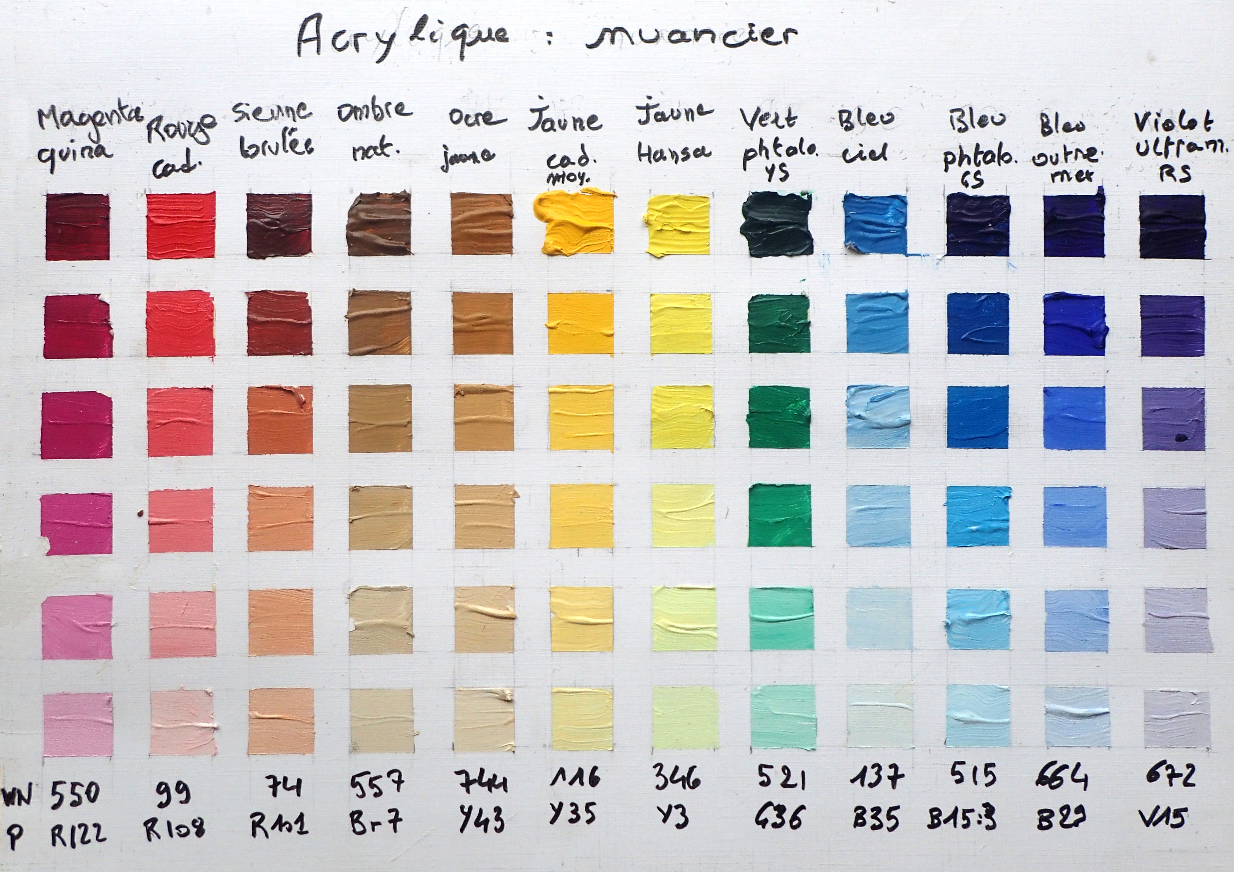
In each column of the color-chart, I first used each color as it came from the rube, and then lightened by adding some titanium white. I first observed that there was redundancies in my first palette: the cerulean blue is very close to the phthalo blue: it could simply be obtained by adding some white in the later. Also, the three earth (Sienna, Umber, Ocre) could be easily obtained by mixing others colors. Moreover, the earth colors are drab while the equivalent color obtained by mixing is often better. So, I simplified my palette, reducing it to eight colors.
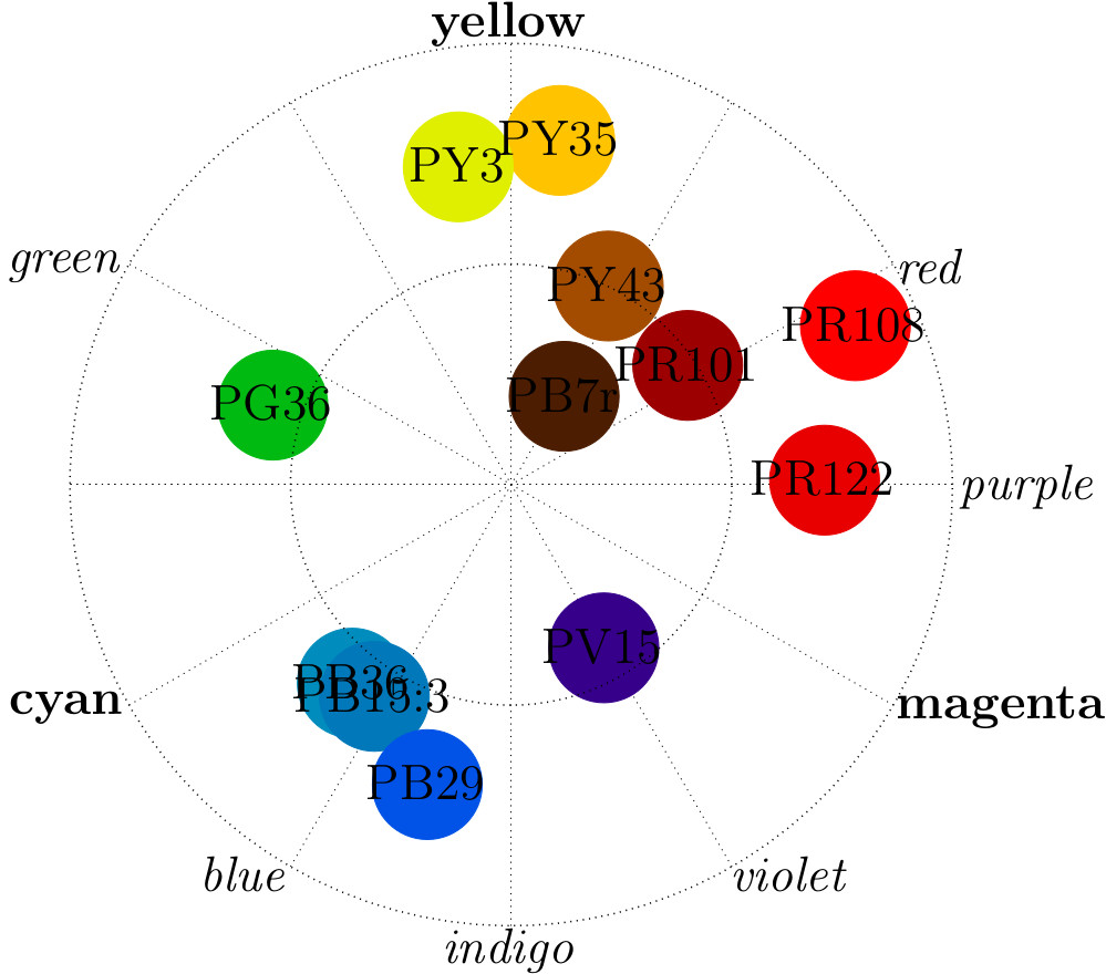
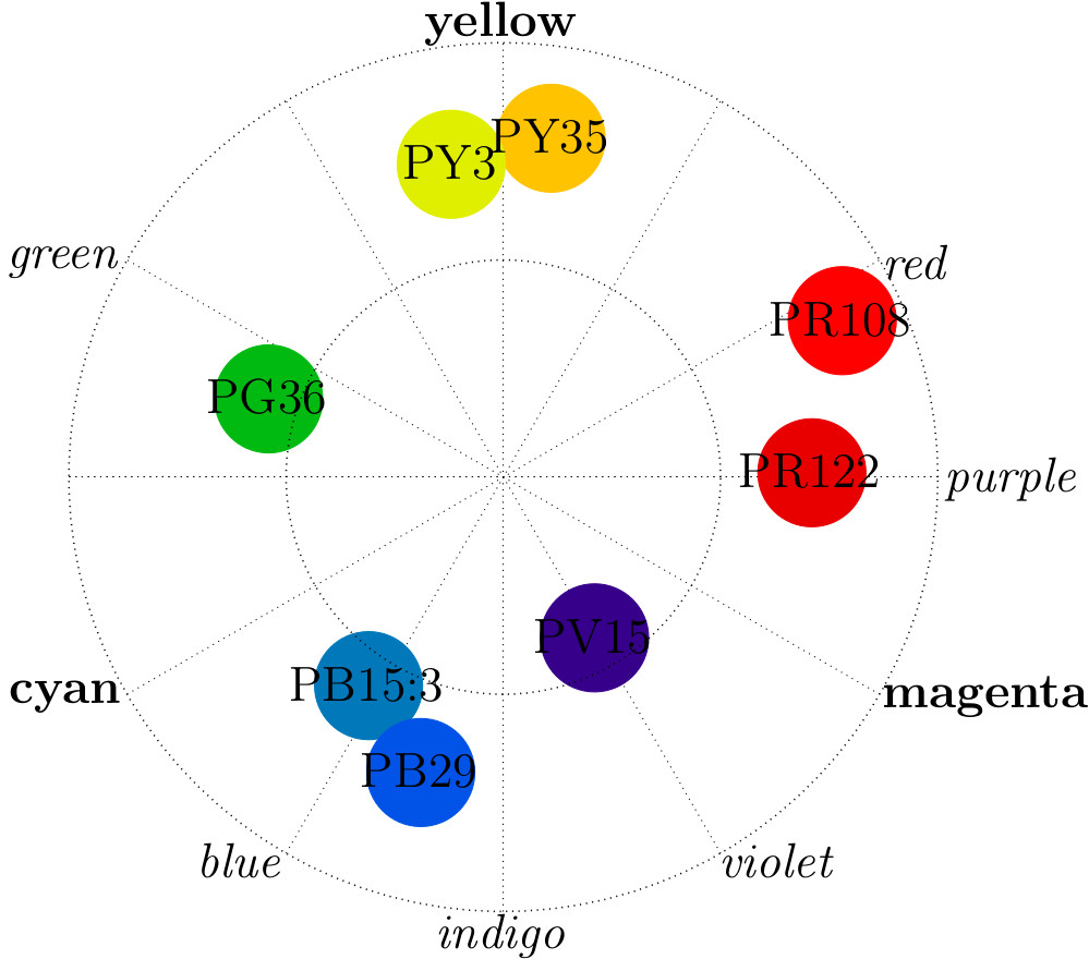
The previous graphics represents my initial palette on the left and the reduced one on the right. The color circle use a polar representation with the hue as angle and the chroma as radius. I used the CIECAM data base provided by Bruce MacEvoy and the gnuplot free software to realize the plots. Note that the colors are better distributed in the new version of the palette.
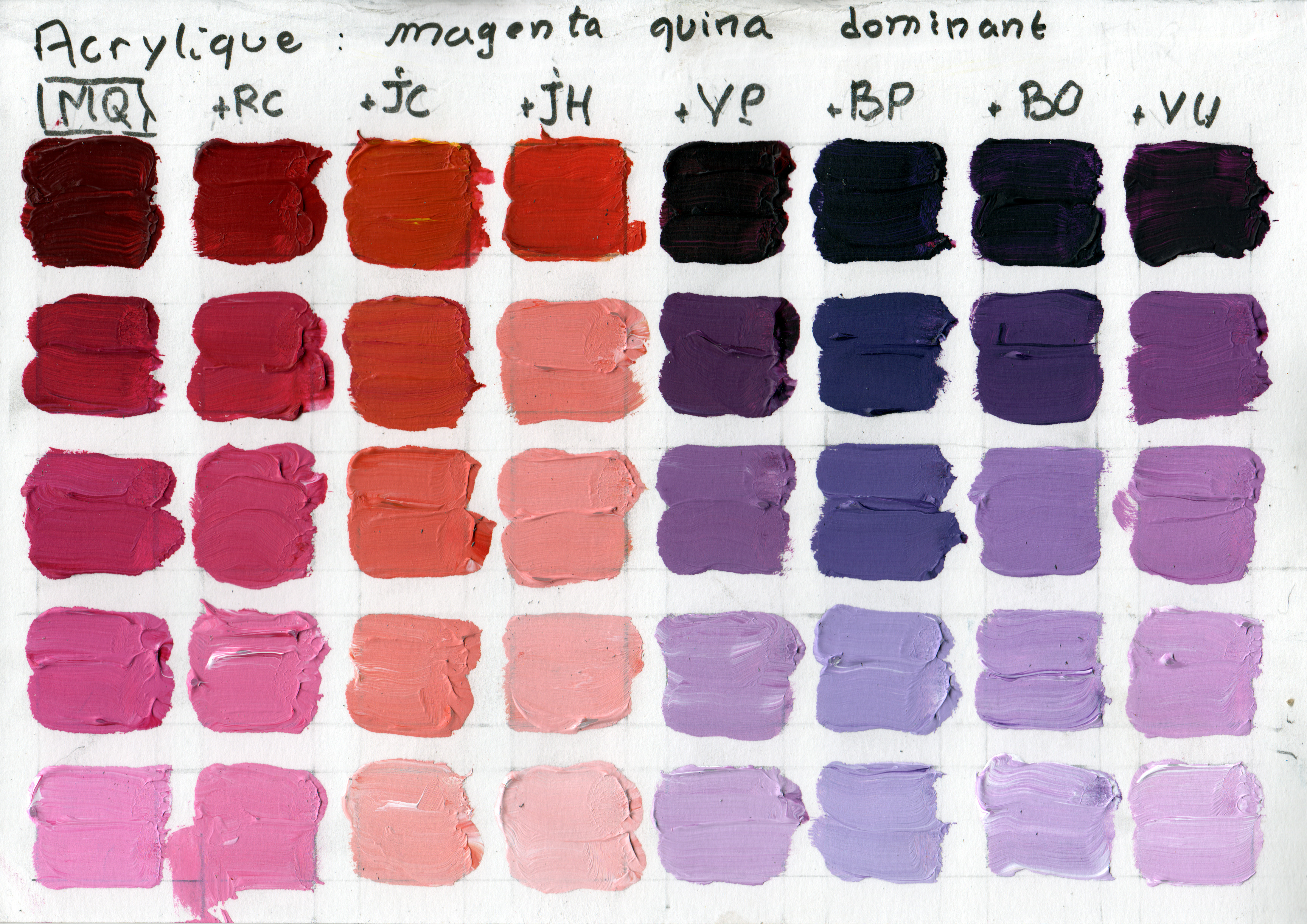
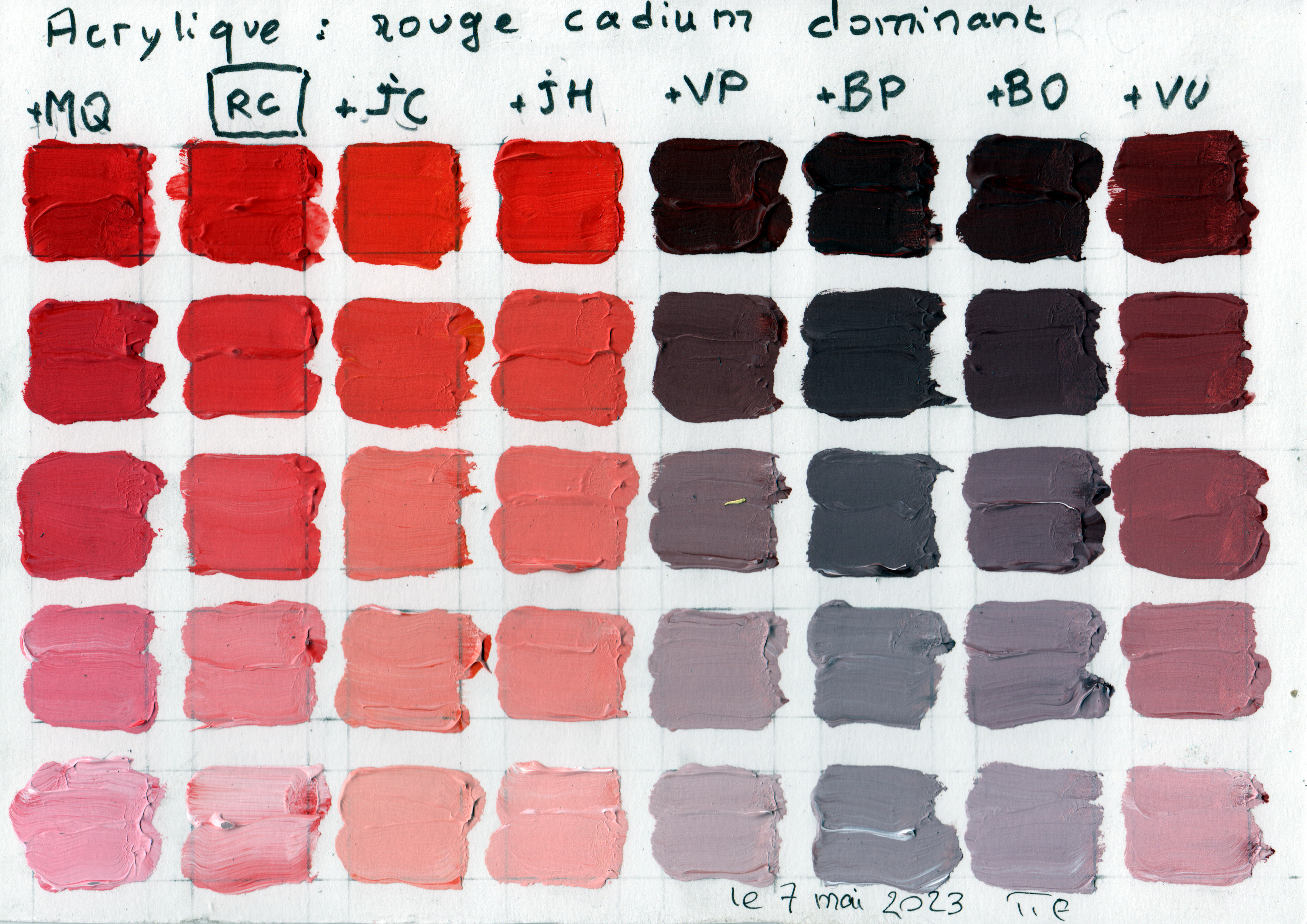
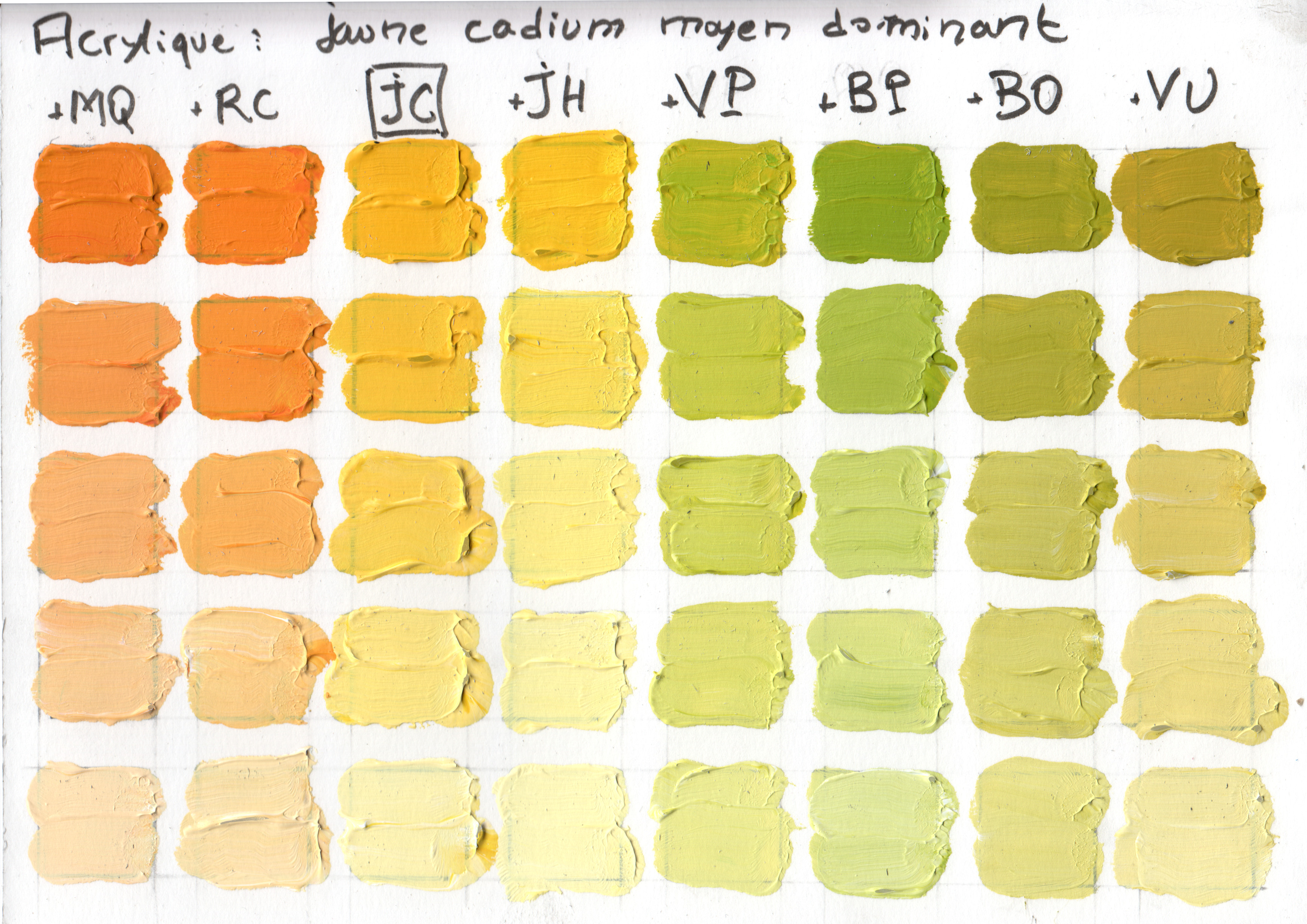
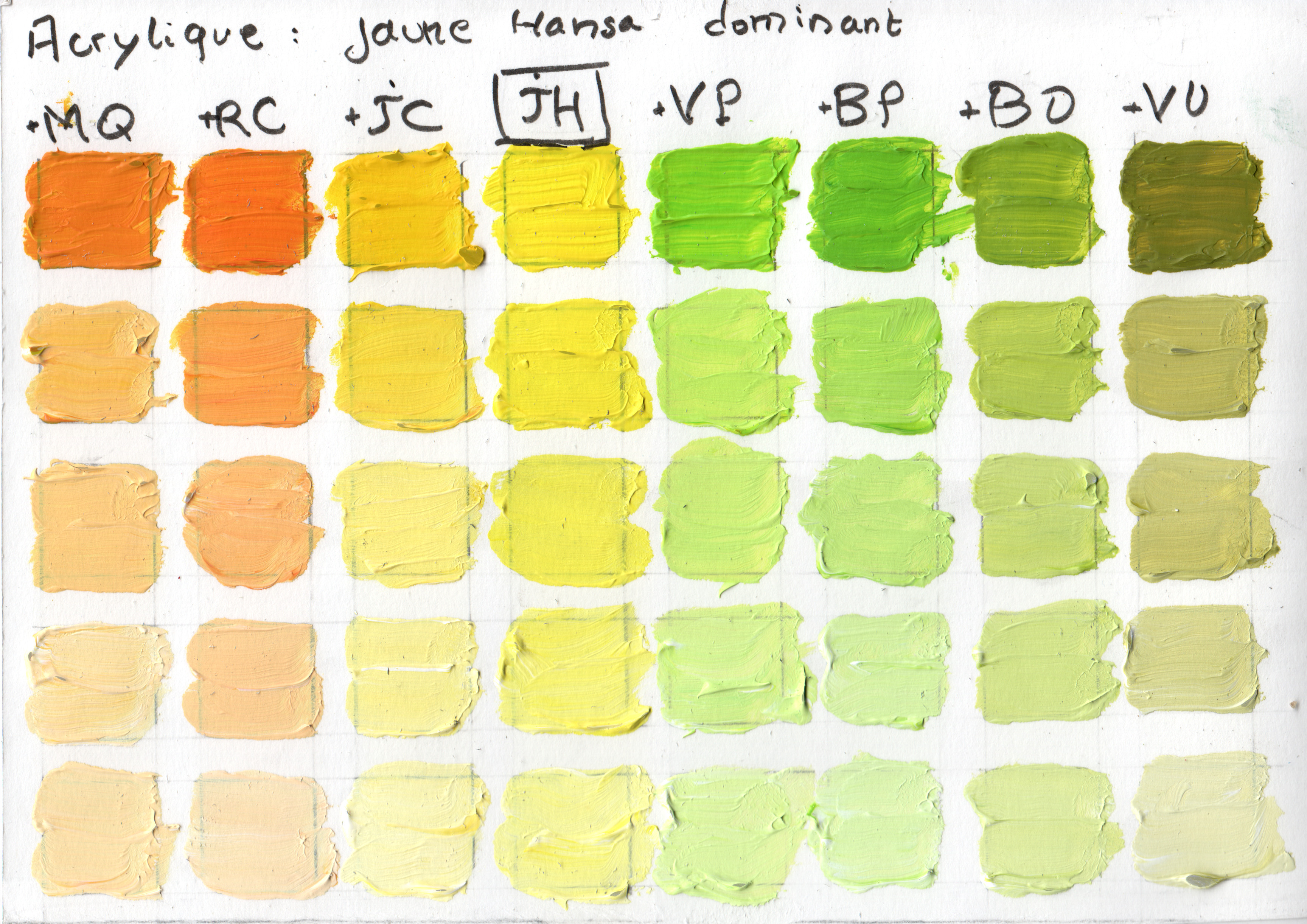
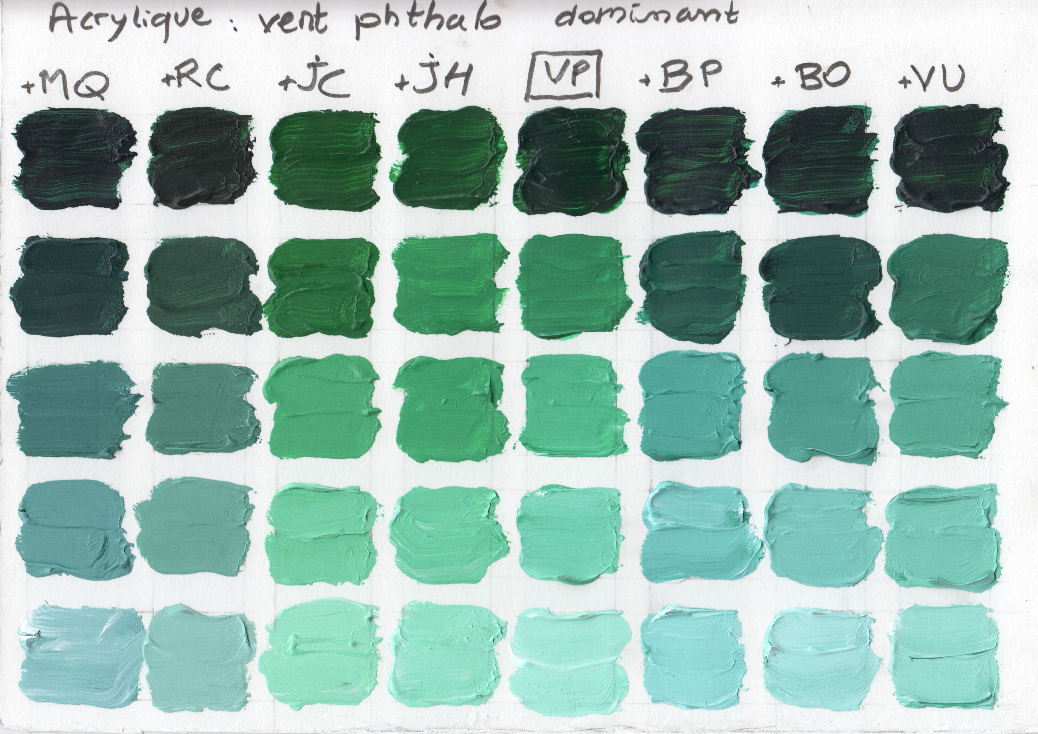
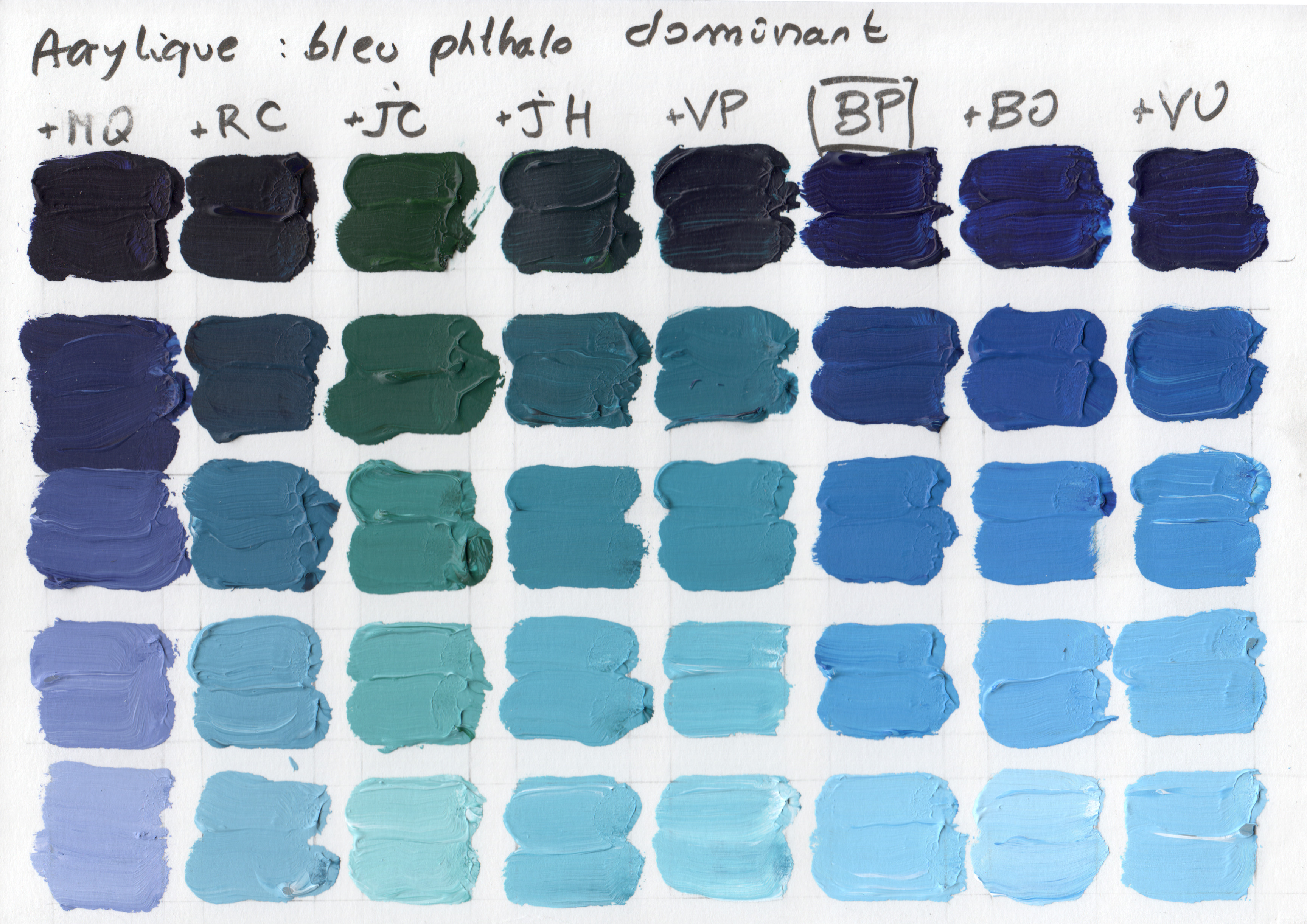
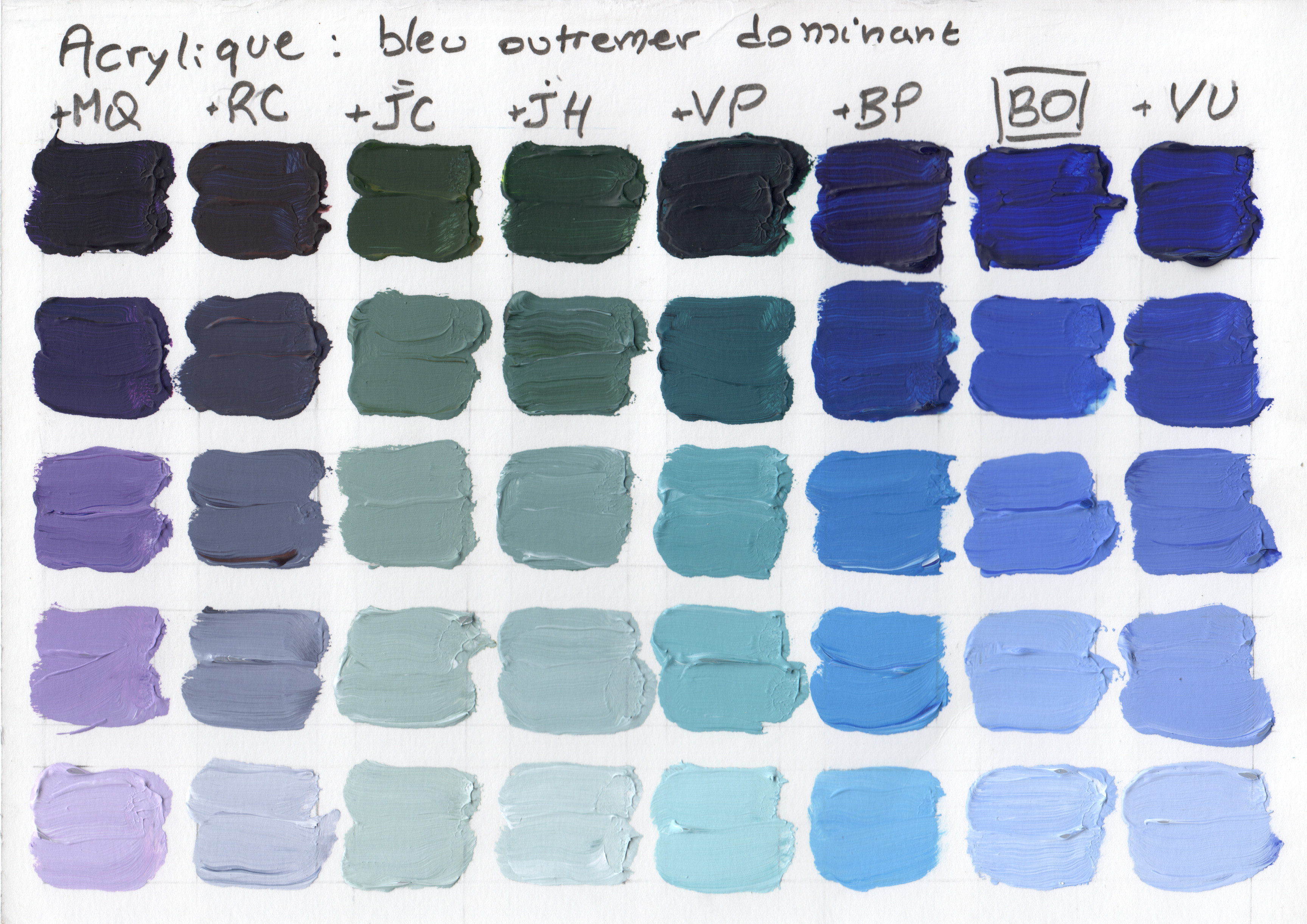
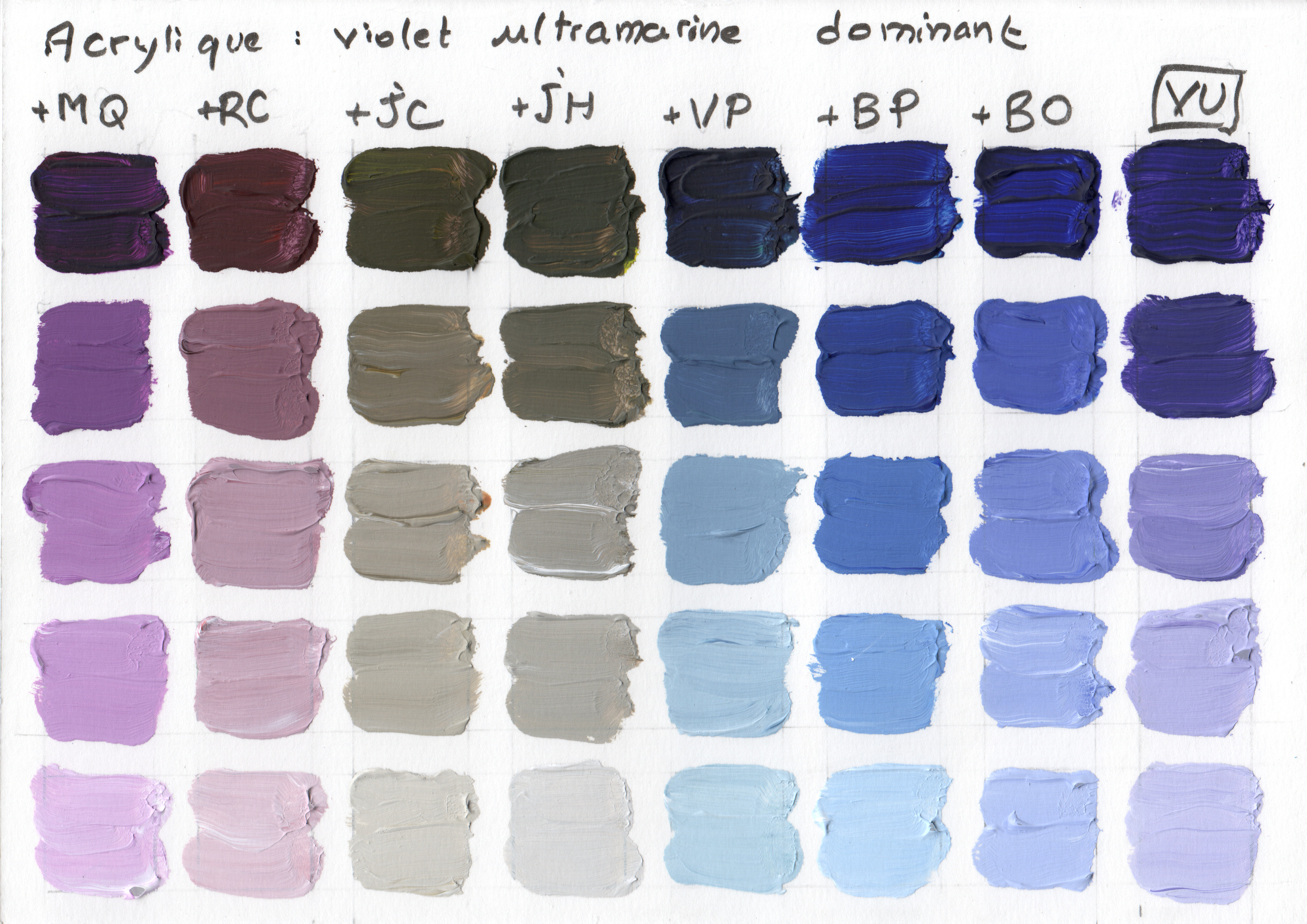
Next I continued to follow the book Alla prima by Richard Schmid, page 130: for each color, I realized a similar chart, but by mixing each color with all the others, while the initial color should be predominant. I obtained eight charts, each of them having height columns. After doing that, I better understood what happens when mixing colors of my palette together.
Acrylic, about 21x30cm.