 Palette and color-chart
To mix my acrylic colors as I want, I must have a basic and well balanced set of pigments, and I must know what will happen when I mix them together. So, during a long weekend, I decided to paint a color-chart for better understanding and mastering colors. I first defined my palette with twelve colors:
| name | pigment | winsor-newton |
|---|---|---|
| magenta quinacridone | PR122 | 550 |
| red cadium | PR108 | 99 |
| sienne brunt | PR101 | 74 |
| Umber raw | PBr7 | 557 |
| Ocre | PY43 | 744 |
| yellow cadium medium | PY35 | 116 |
| yellow Hansa | PY3 | 346 |
| green phthalo | PG36 | 521 |
| blue cerulean | PB35 | 137 |
| blue phthalo | PB15:3 | 515 |
| blue ultramarine | PB29 | 664 |
In the second column, I indicated the official pigment symbol. The number in the last column is the index in the Winsor Newton acrylic catalog. I then started my first color-chart: I followed the book Alla prima by Richard Schmid, page 130. Note that this book is now feely available for downloading
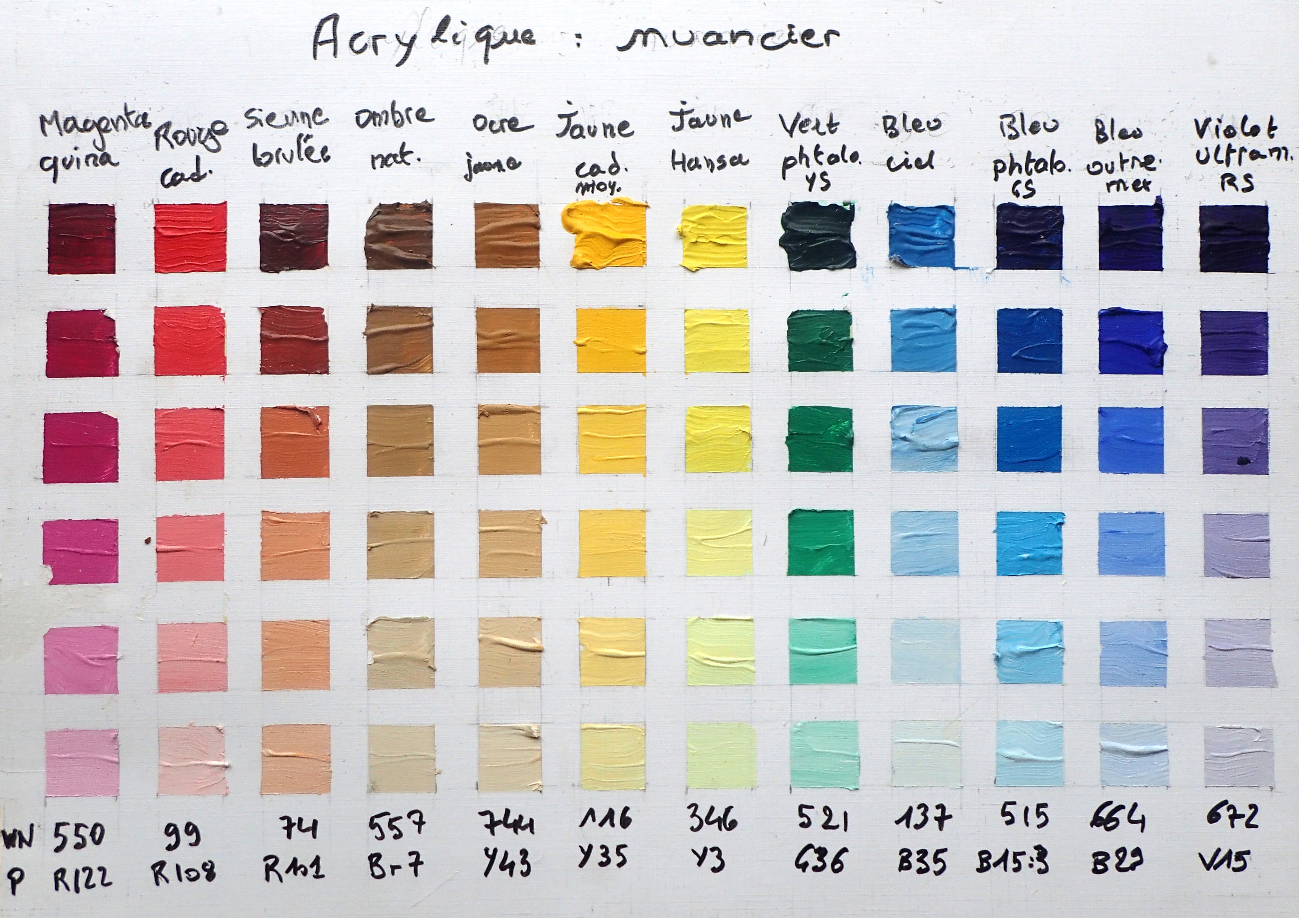
In each column of the color-chart, I first used each color as it came from the rube, and then lightened by adding some titanium white. I first observed that there was redundancies in my first palette: the cerulean blue is very close to the …
Read more: