 La dent de Crolles
Grenoble is surrounded by breathtaking scenery. One of them is la dent de Crolles: After a little travel, I put my easel by the river.
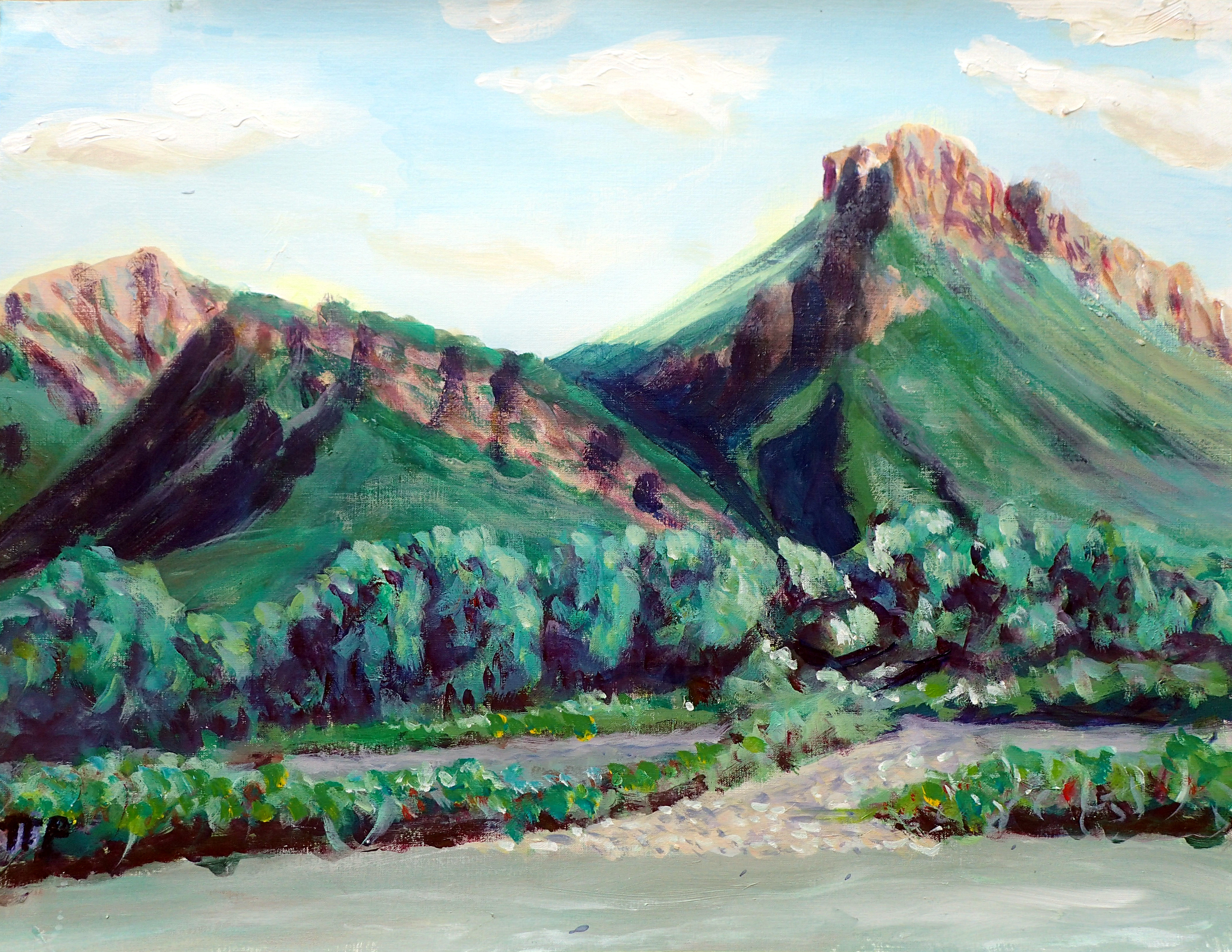
Acrylic, 50x65cm.
