 Geneviève at la Guitoune
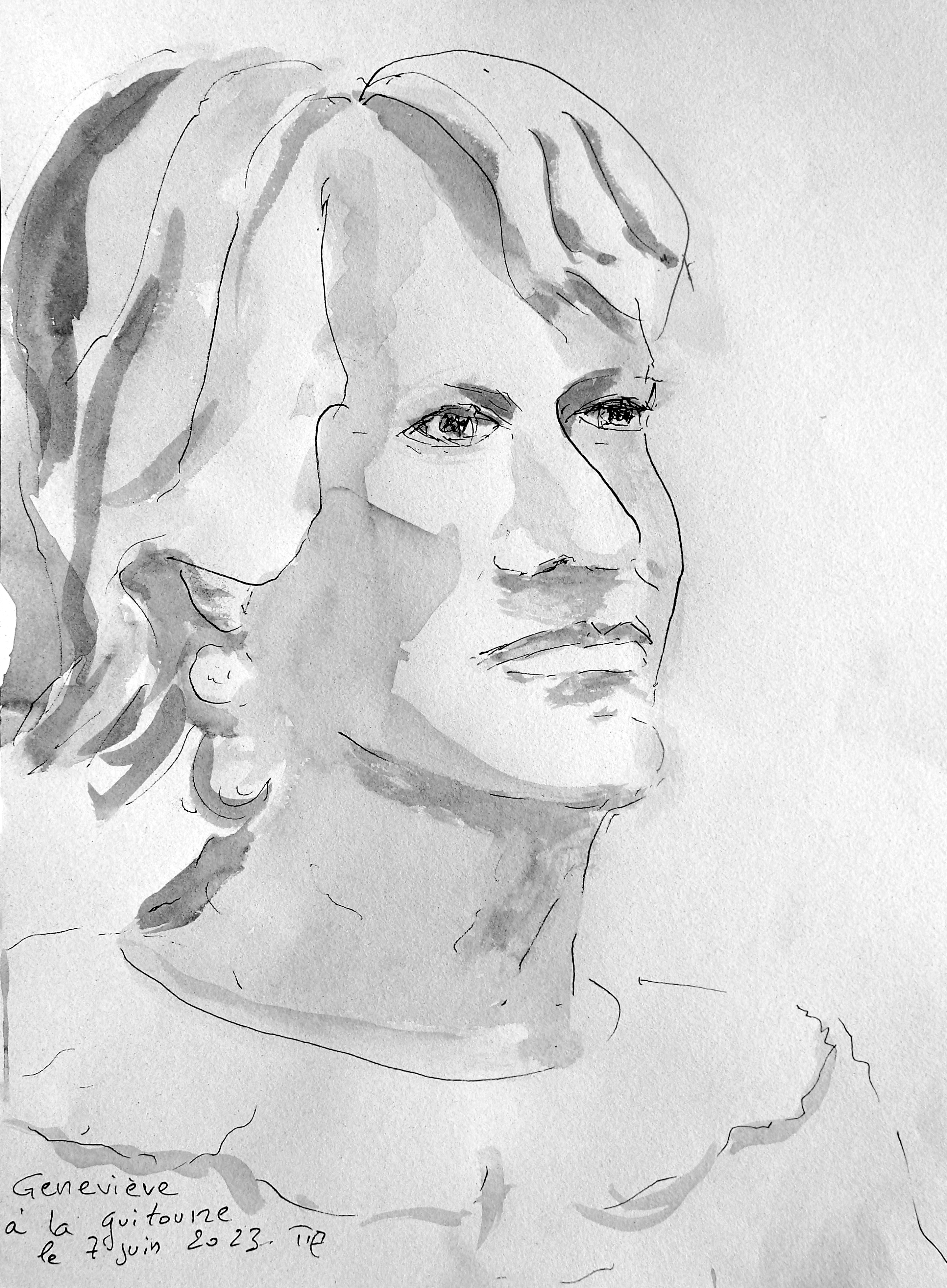
Geneviève at la Guitoune. Watercolor and fineliner-pen, about 30x42cm.
painter & serial designer
Geneviève at la Guitoune. Watercolor and fineliner-pen, about 30x42cm.
This is the last figure drawing session before the holidays: today I use a fineliner-pen and watercolor.
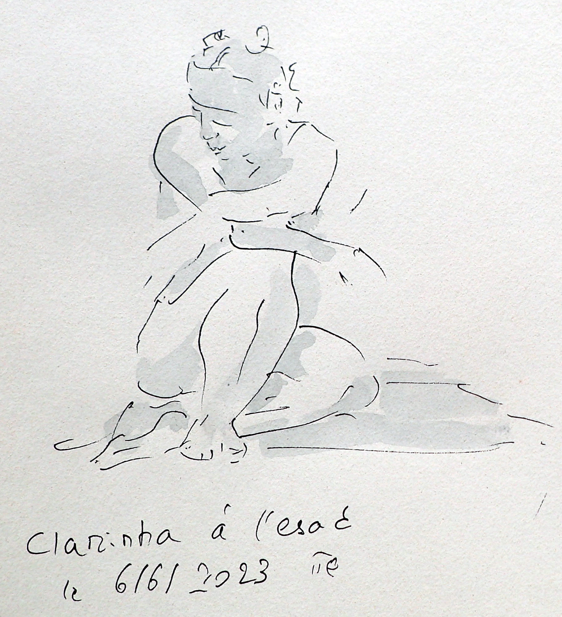
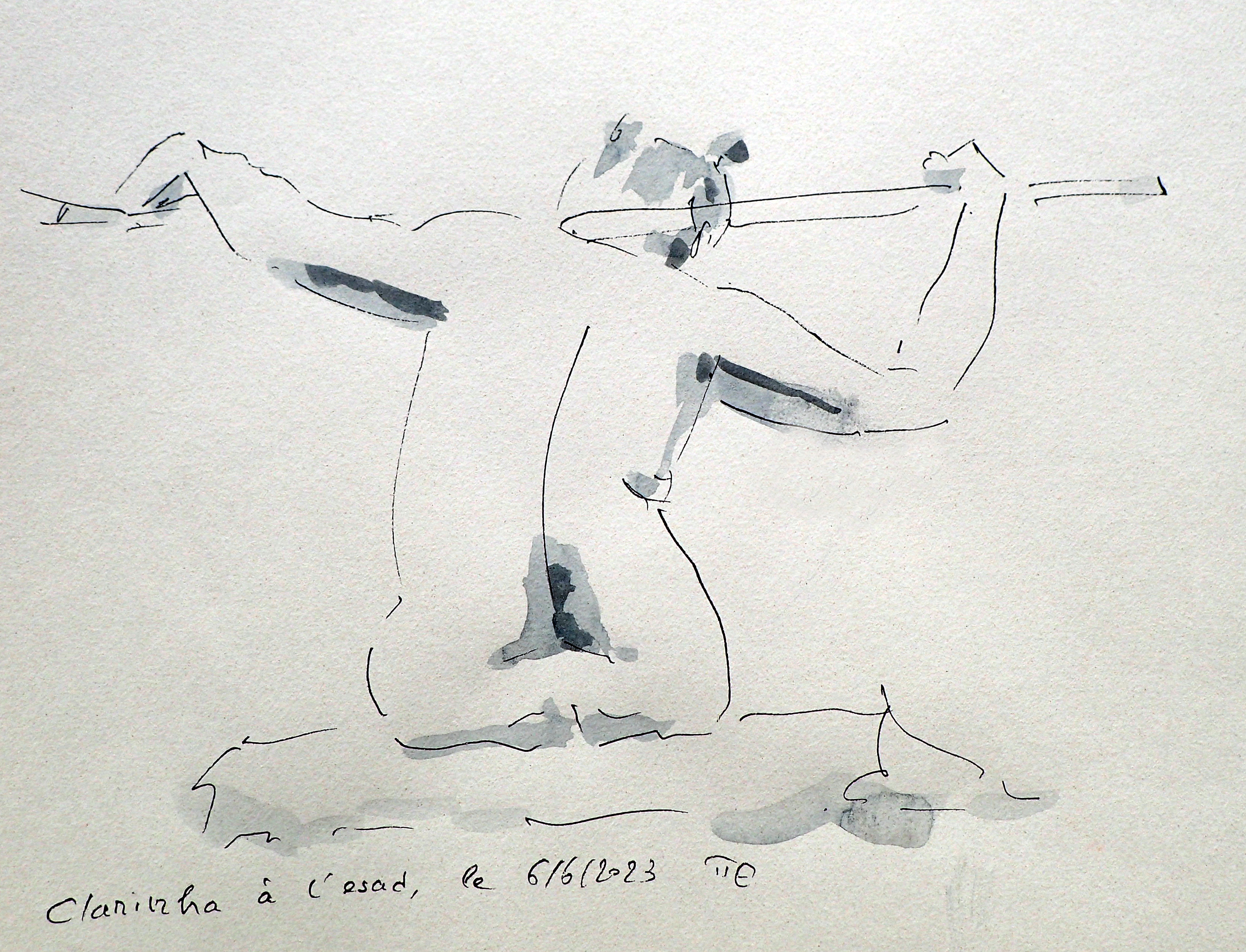
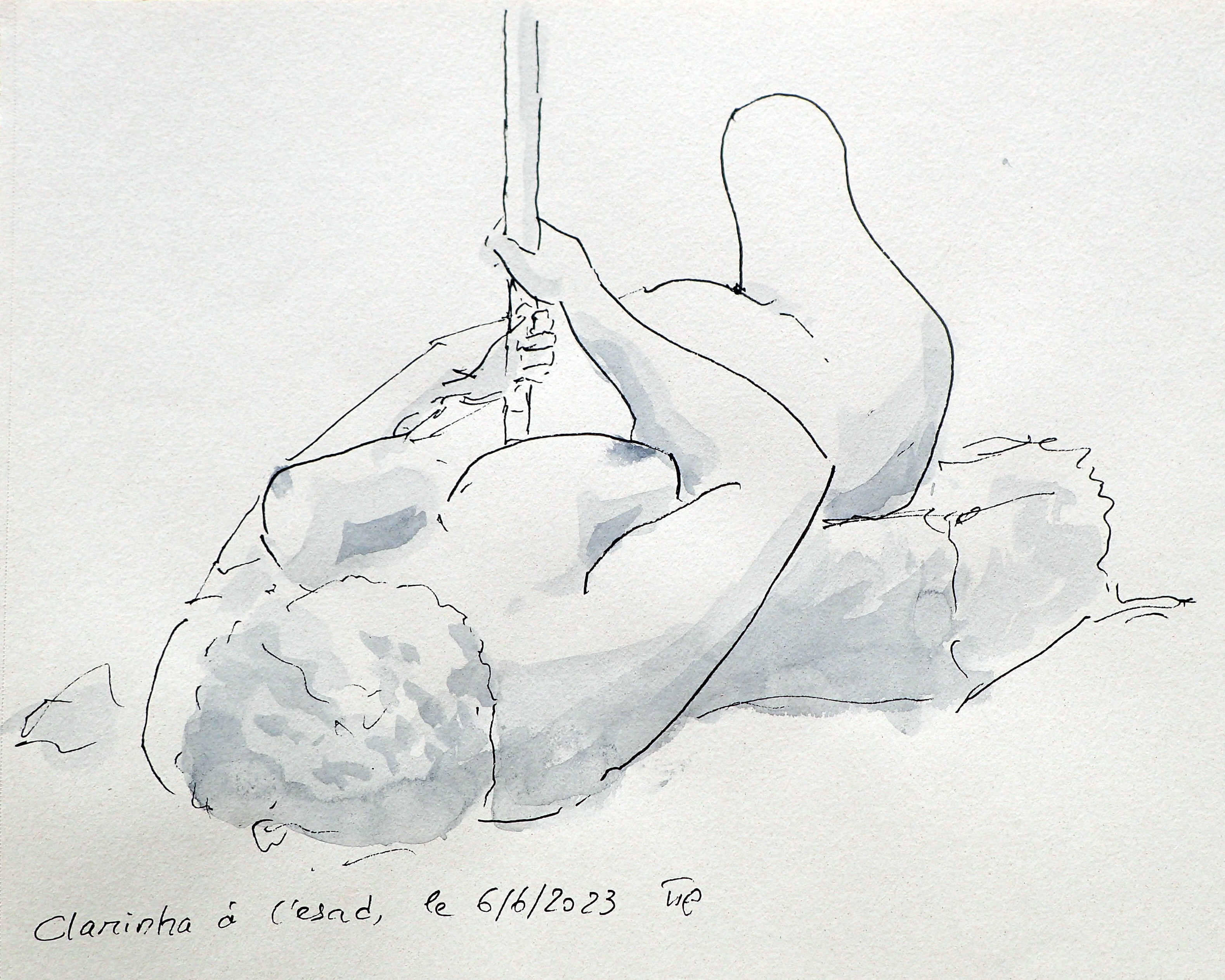
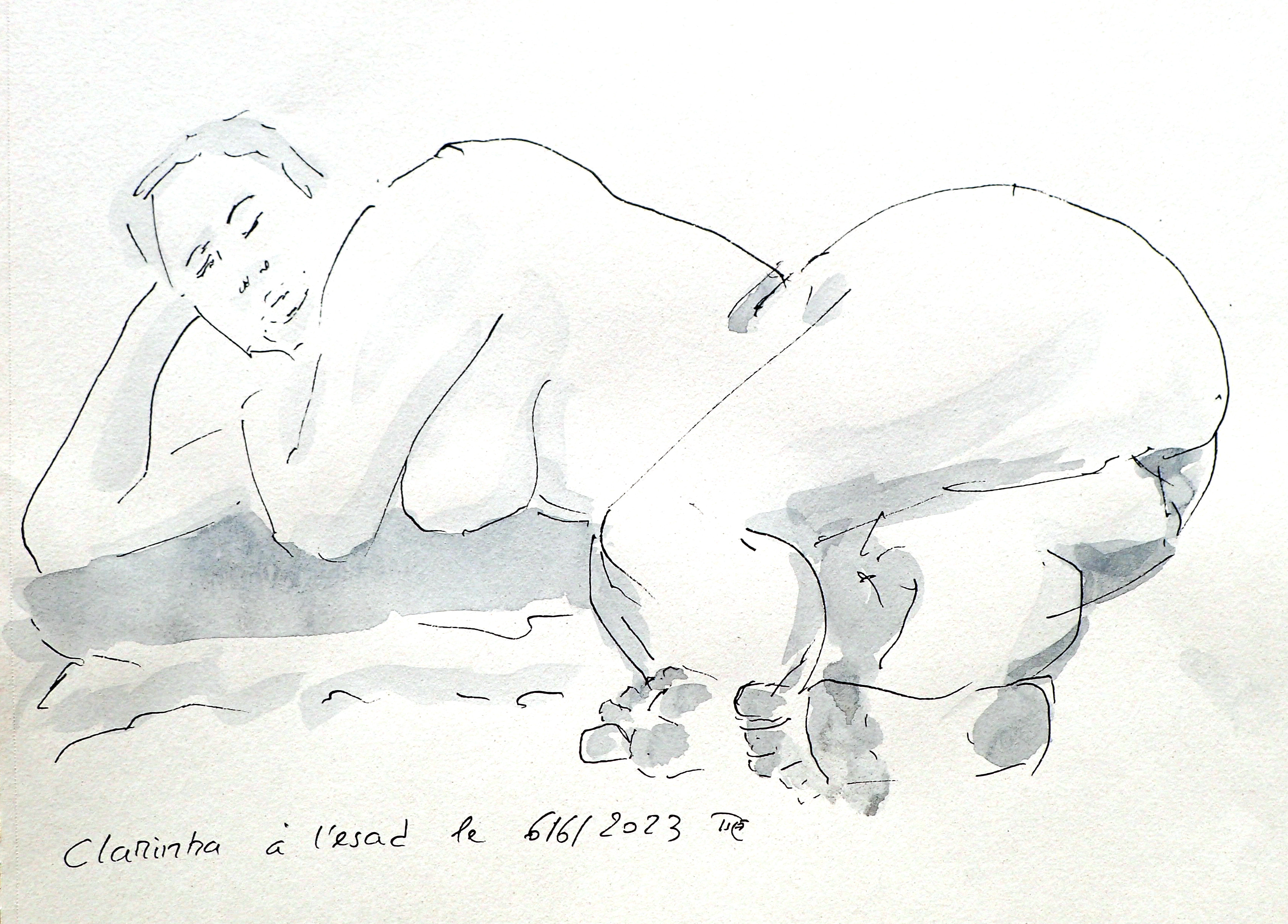
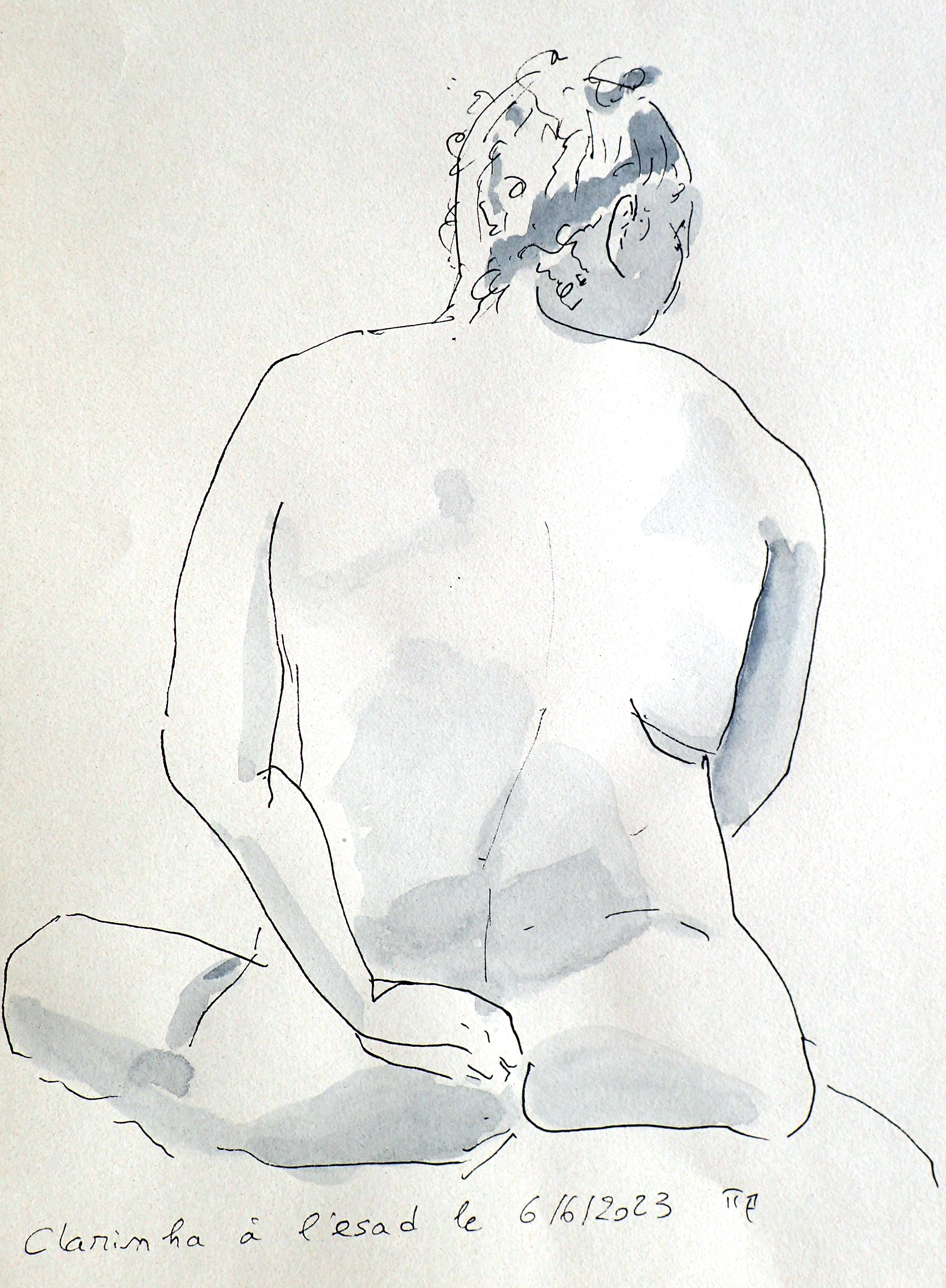
Clarinha at l'ESAD. Watercolor and fineliner-pen, about 42x30cm. Life figure sketch, 10mn.
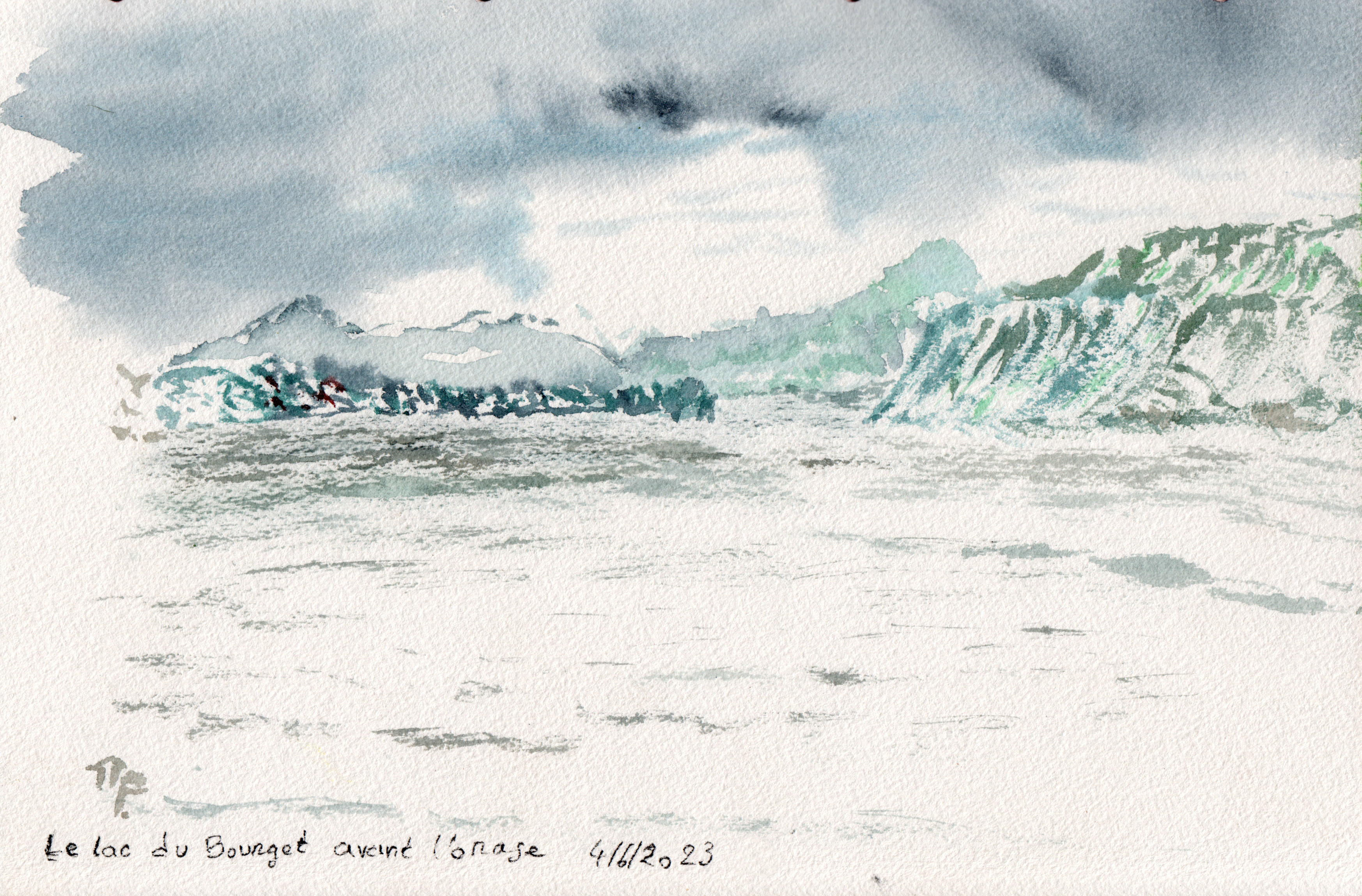
Back from a family meal on mother’s day, I stop my travel at the Bourget lake to swim and make a quick watercolor, just before the storm begins.
My wife recovered and restored an old safe in bad condition. After painting and cleaning, it looked better. I painted some acrylic flowers in the decorative style of Alsatian furniture.
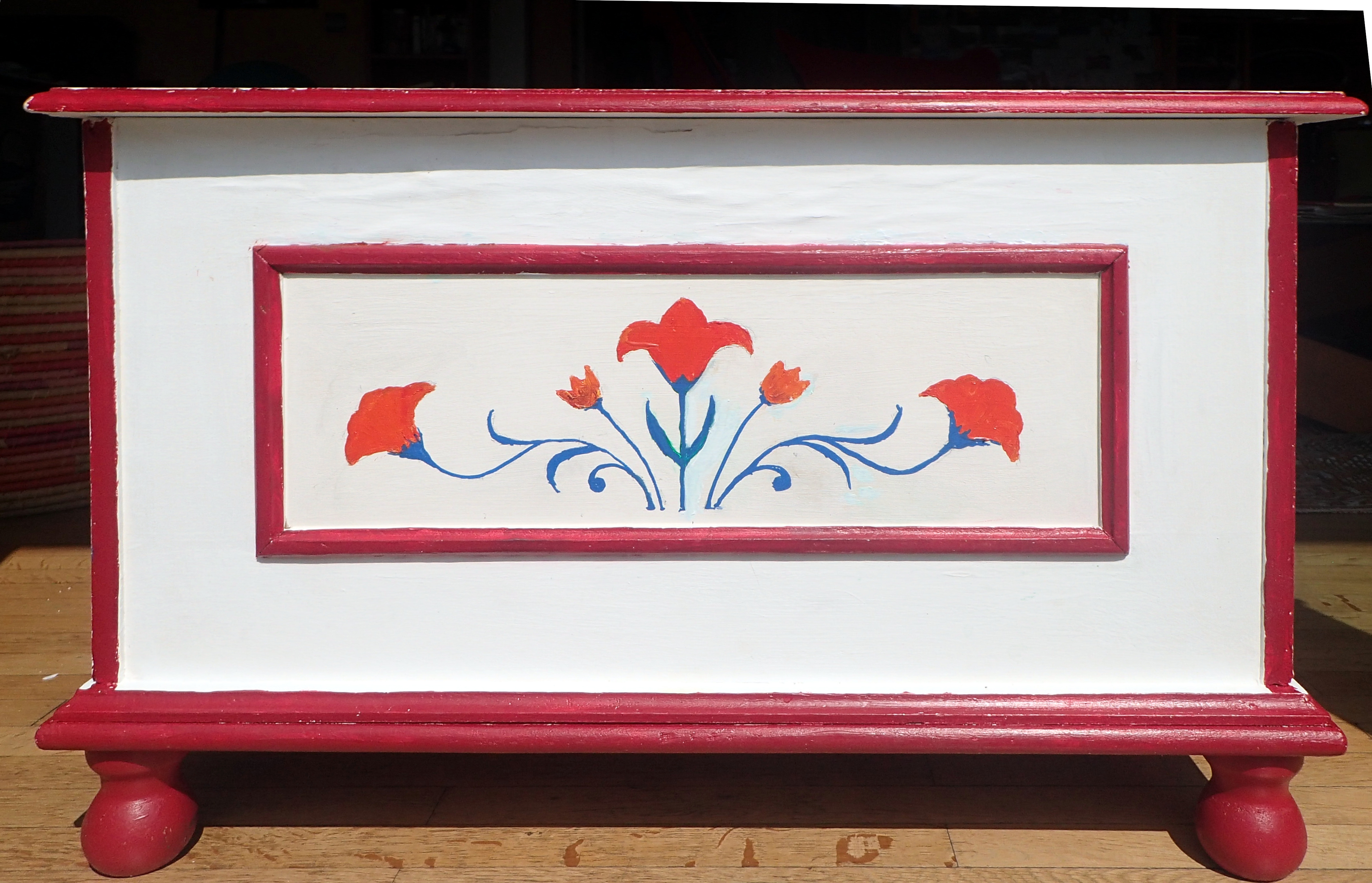
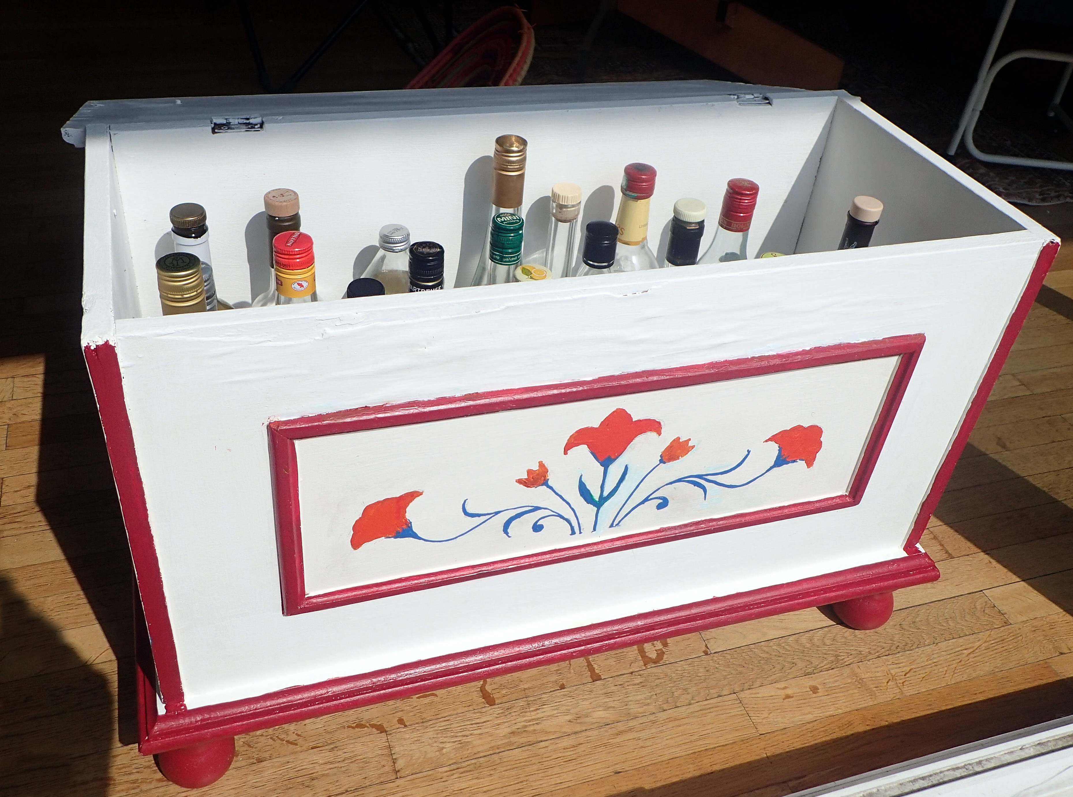
Acrylic, 80x50x40cm.
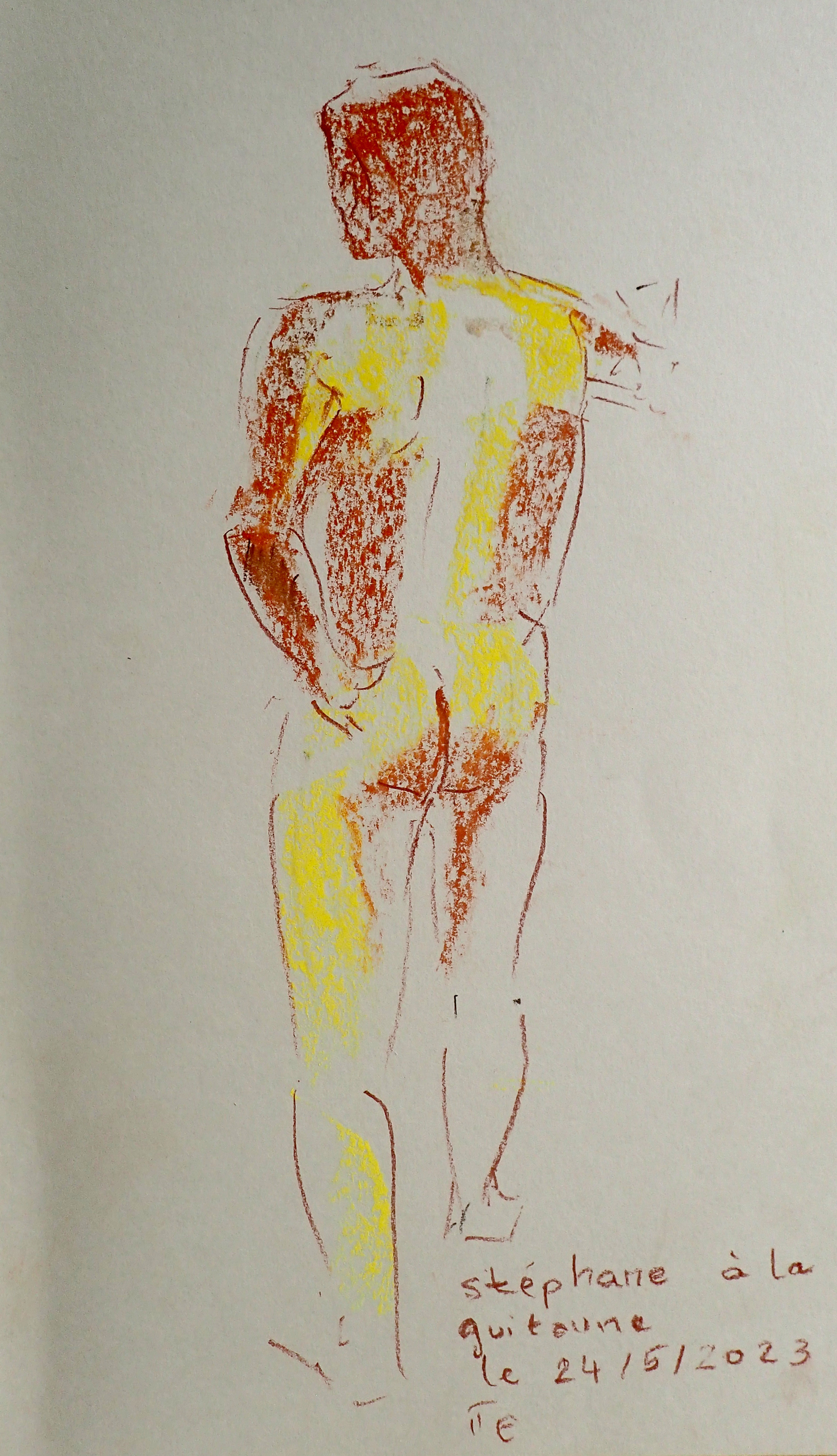
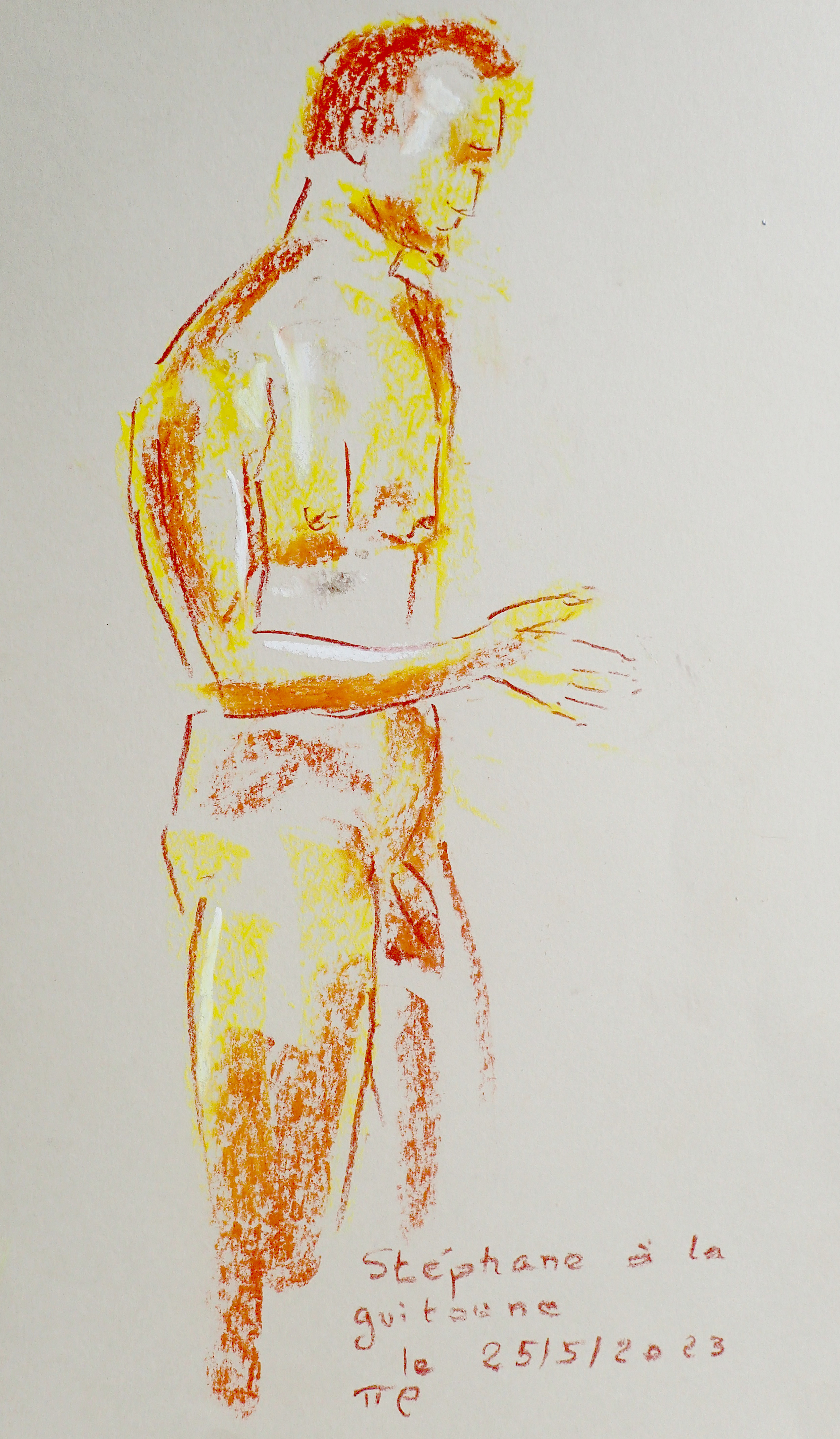
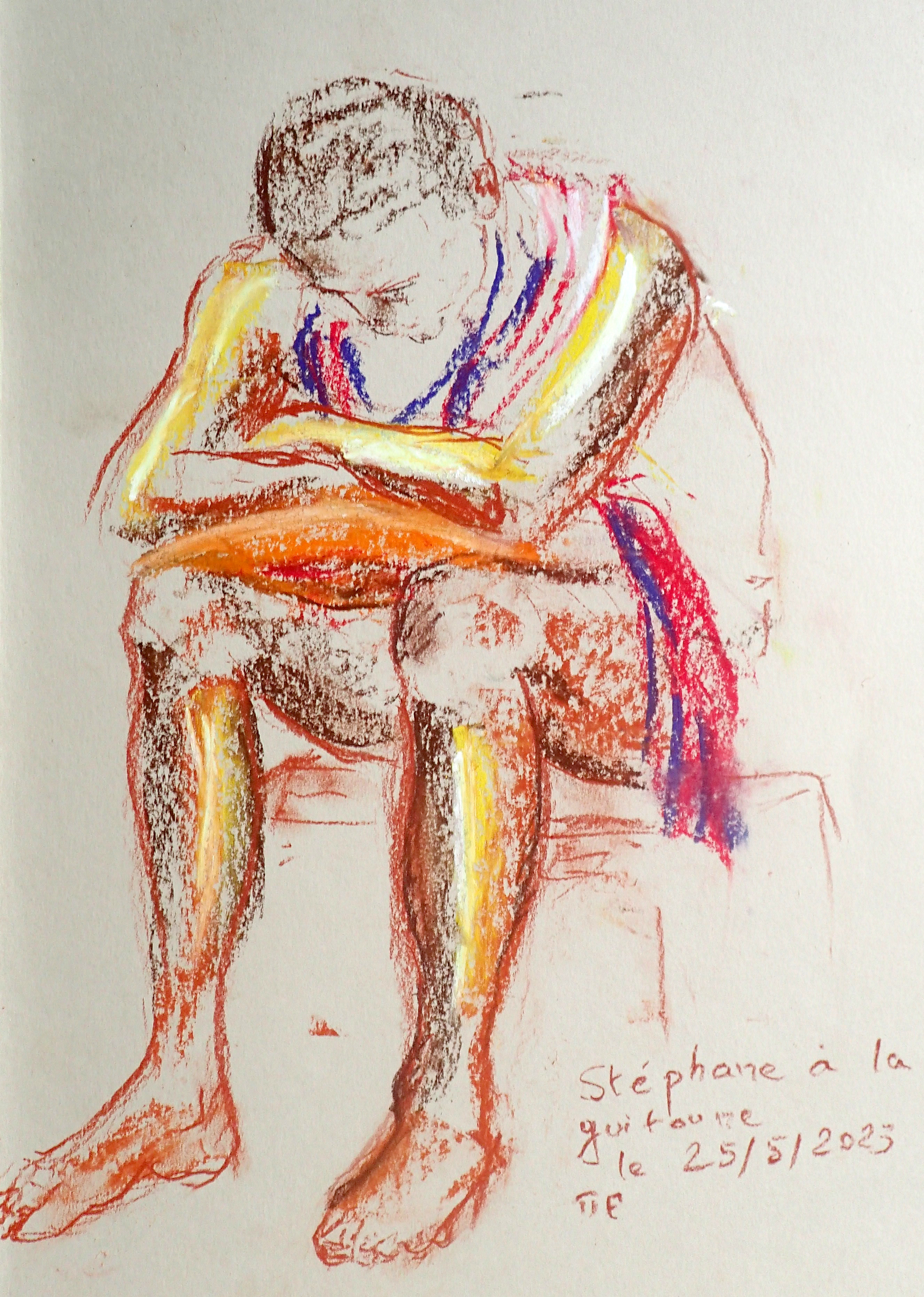
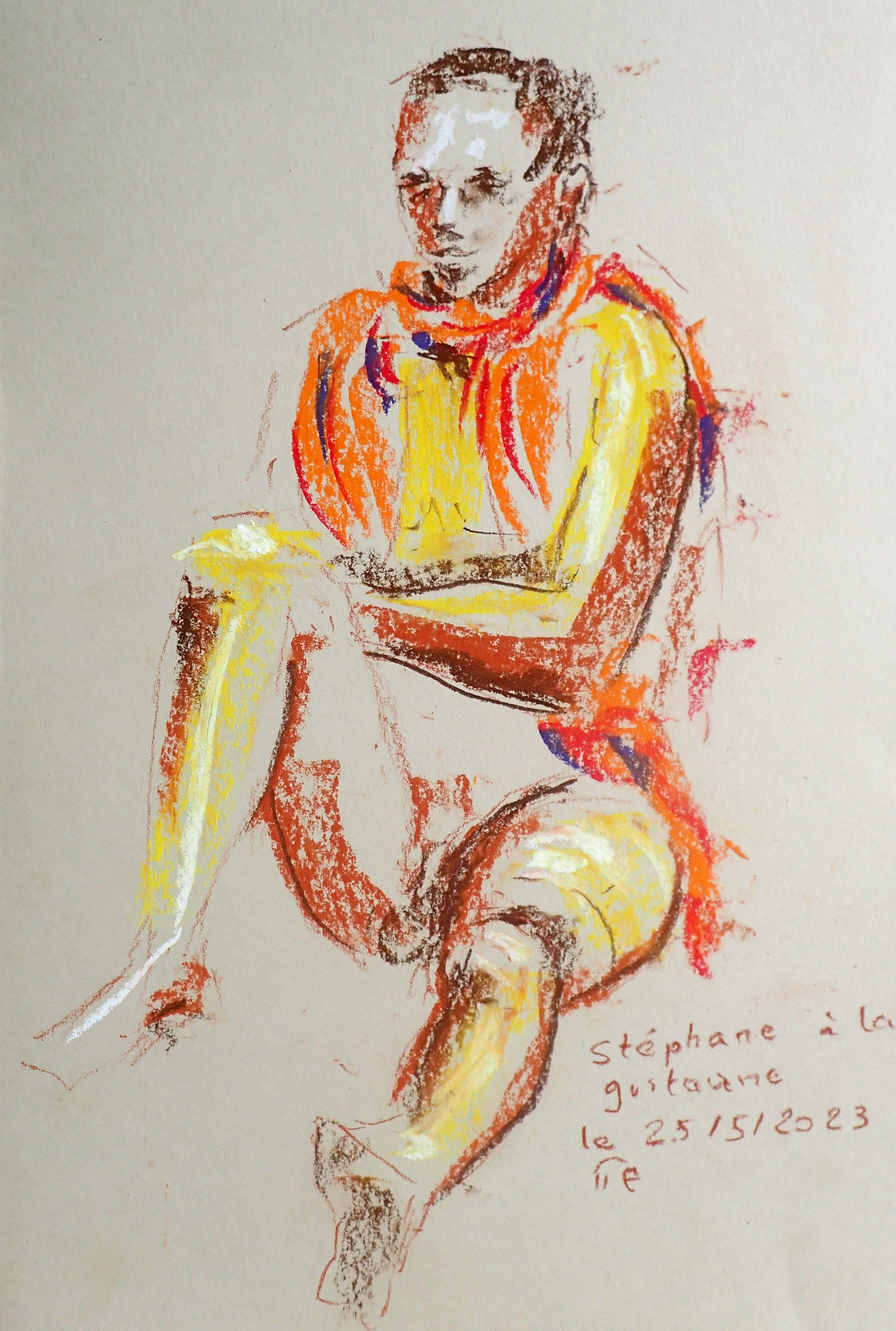
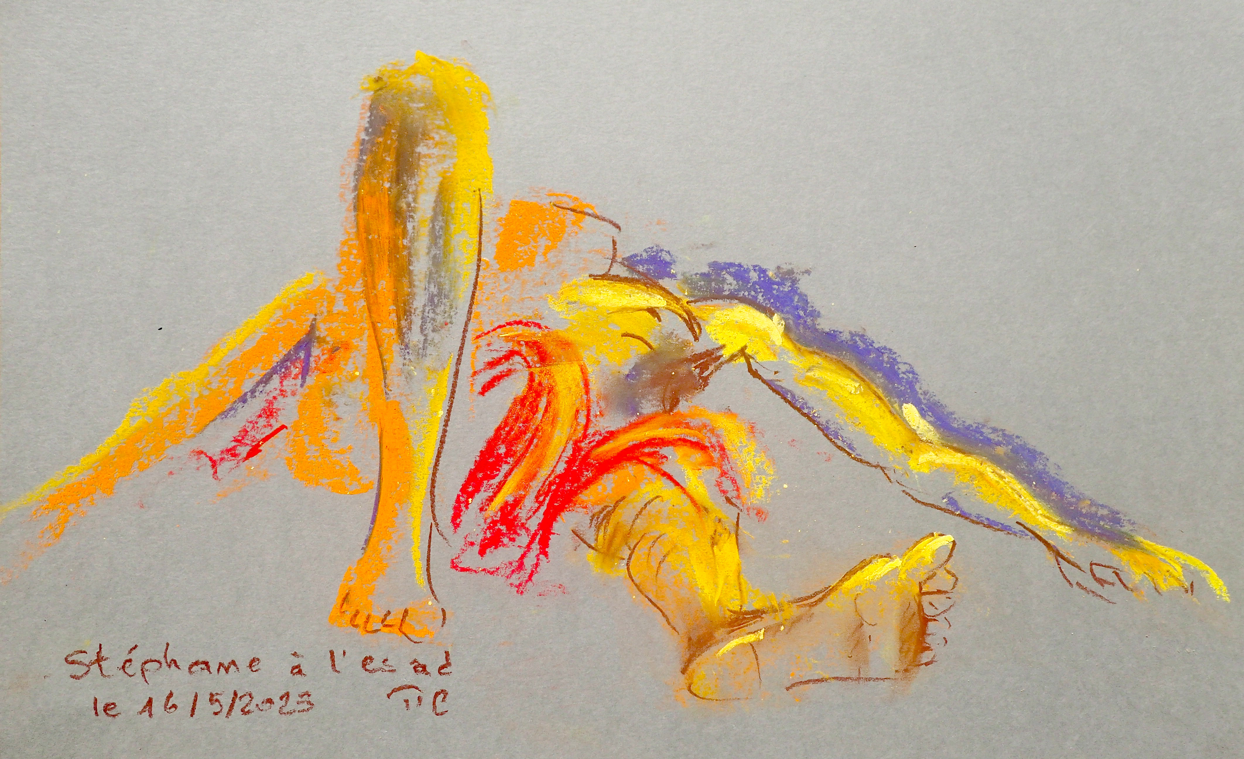
Stéphane at la Guitoune. Pastel, about 42x30cm. Life figure sketch, 10mn.
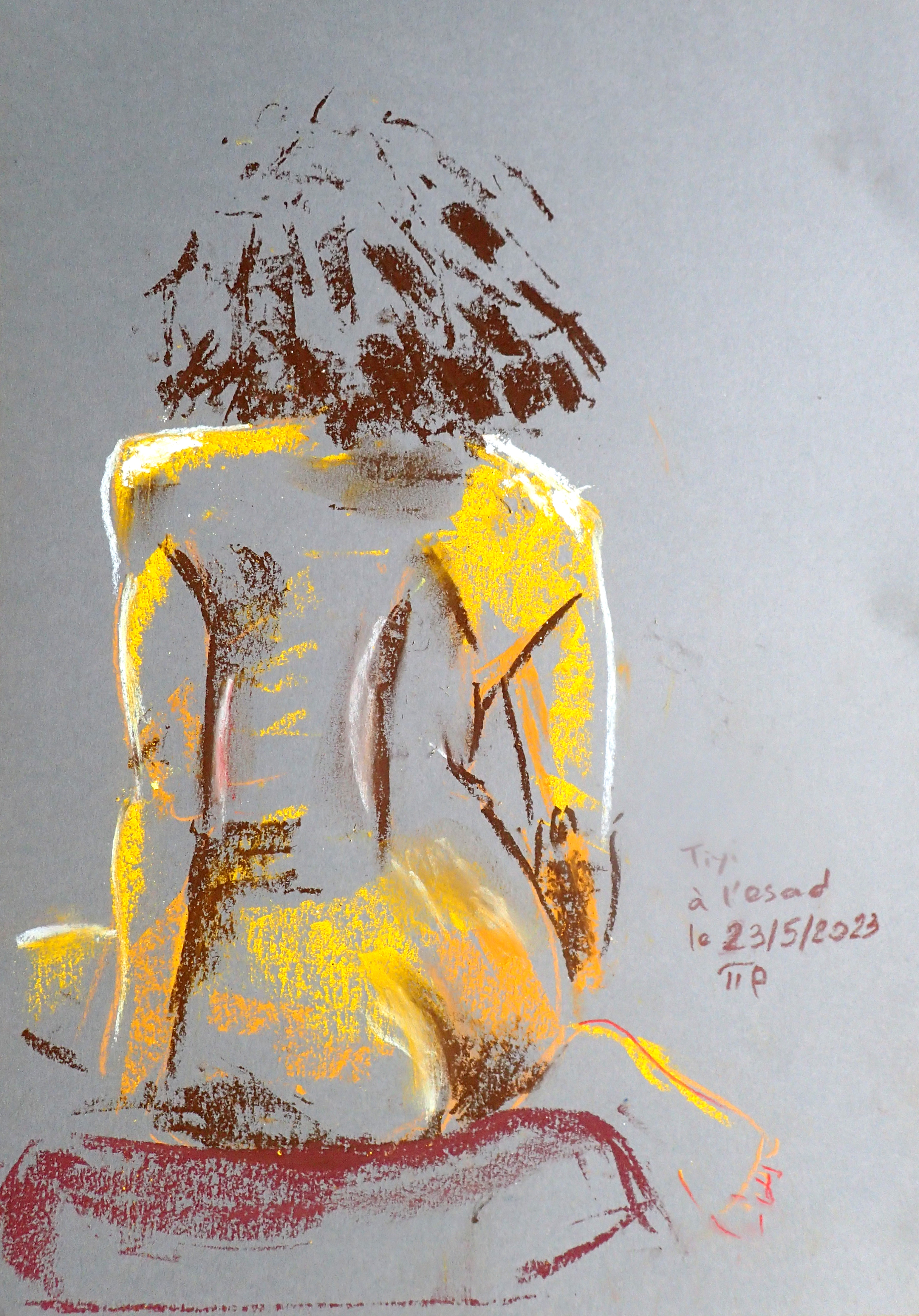
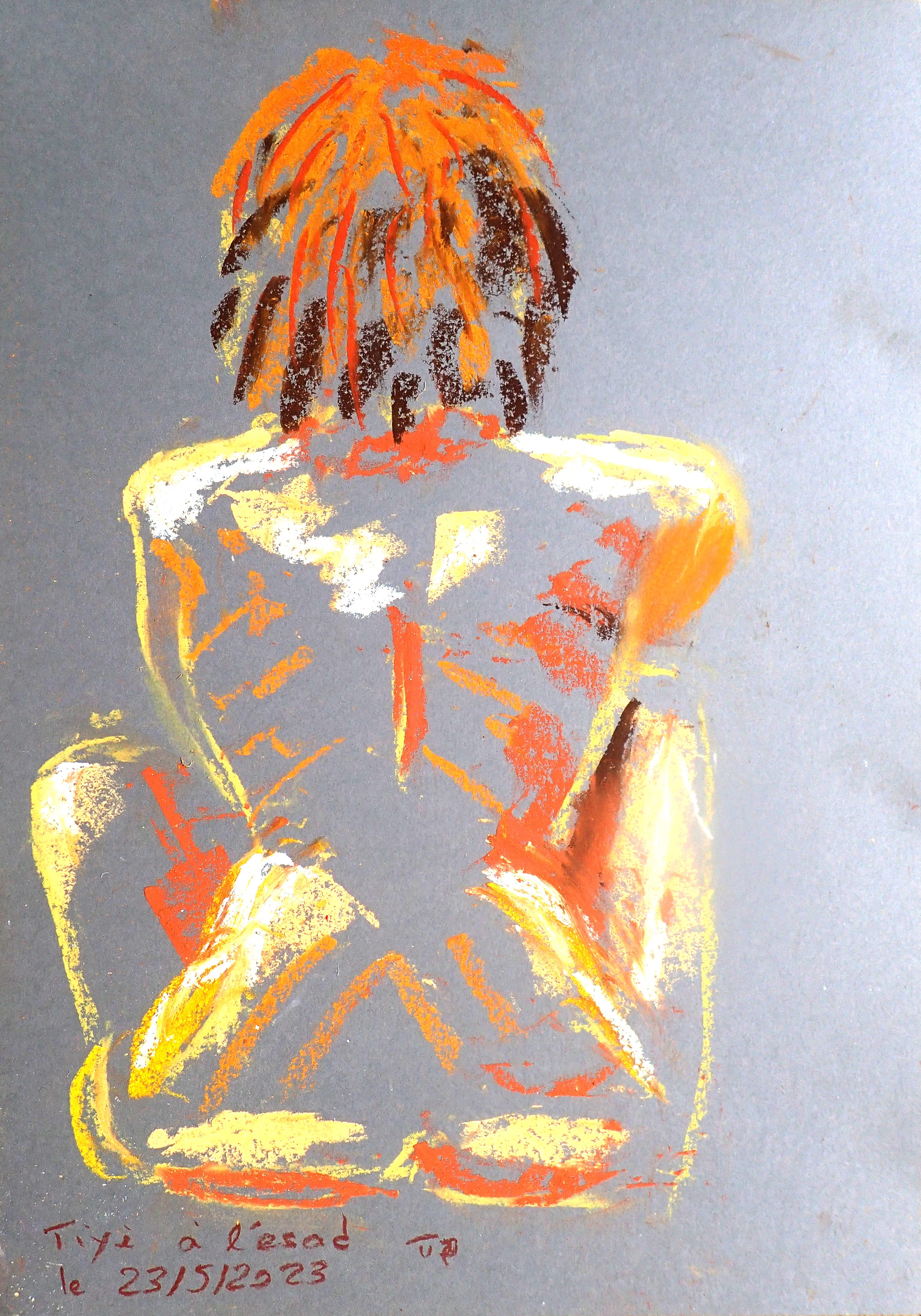
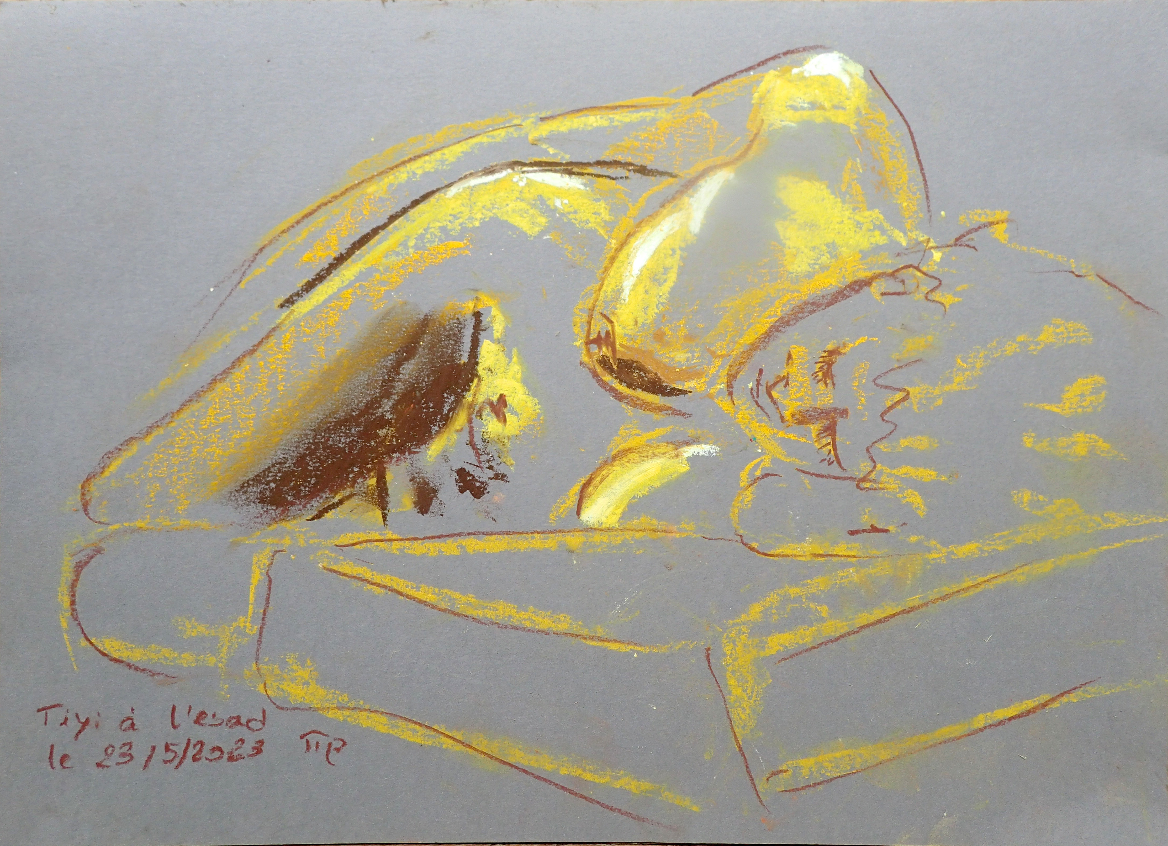
Tiyi at l'ESAD. Pastel, about 30x40cm. Life figure sketch, 10mn.
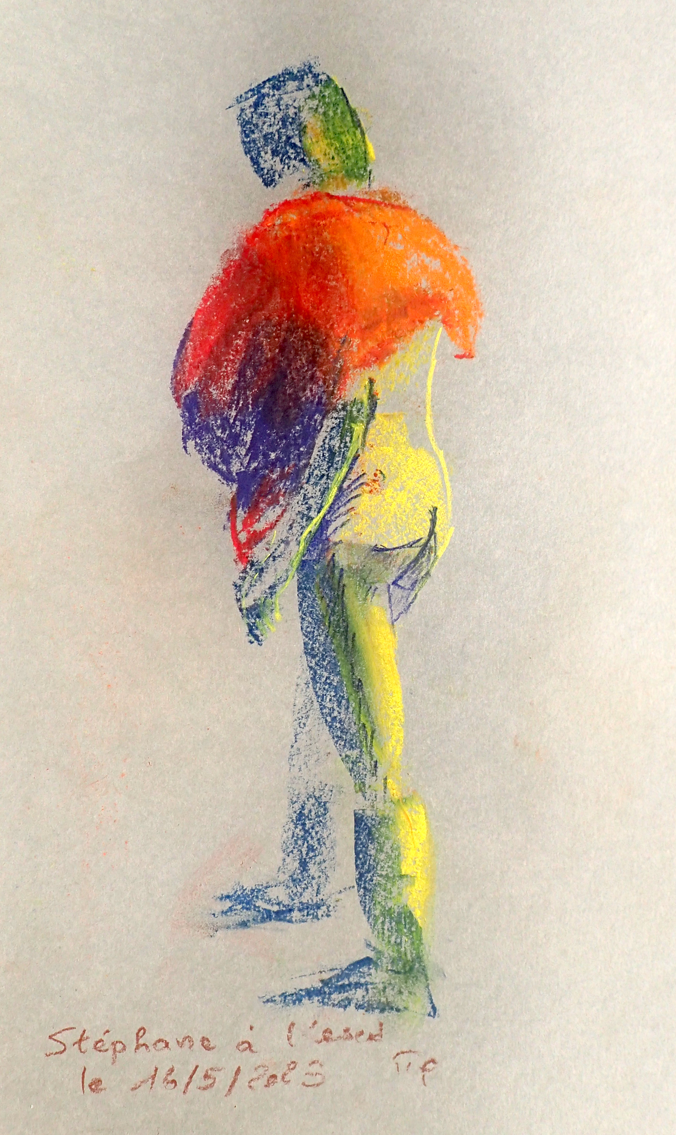
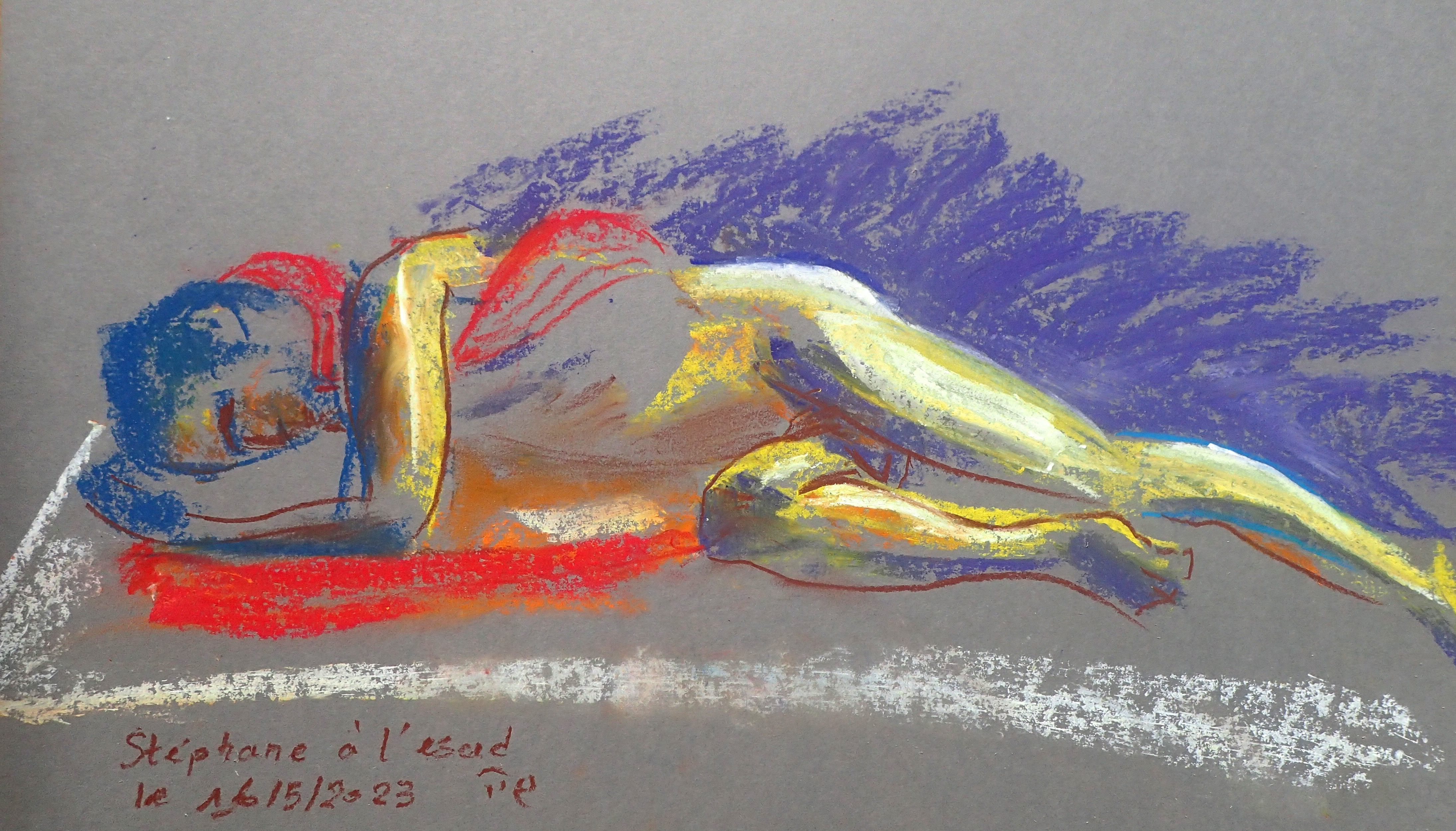
Stéphane at l'ESAD. Pastel, about 42x30cm. Life figure sketch, 10mn.
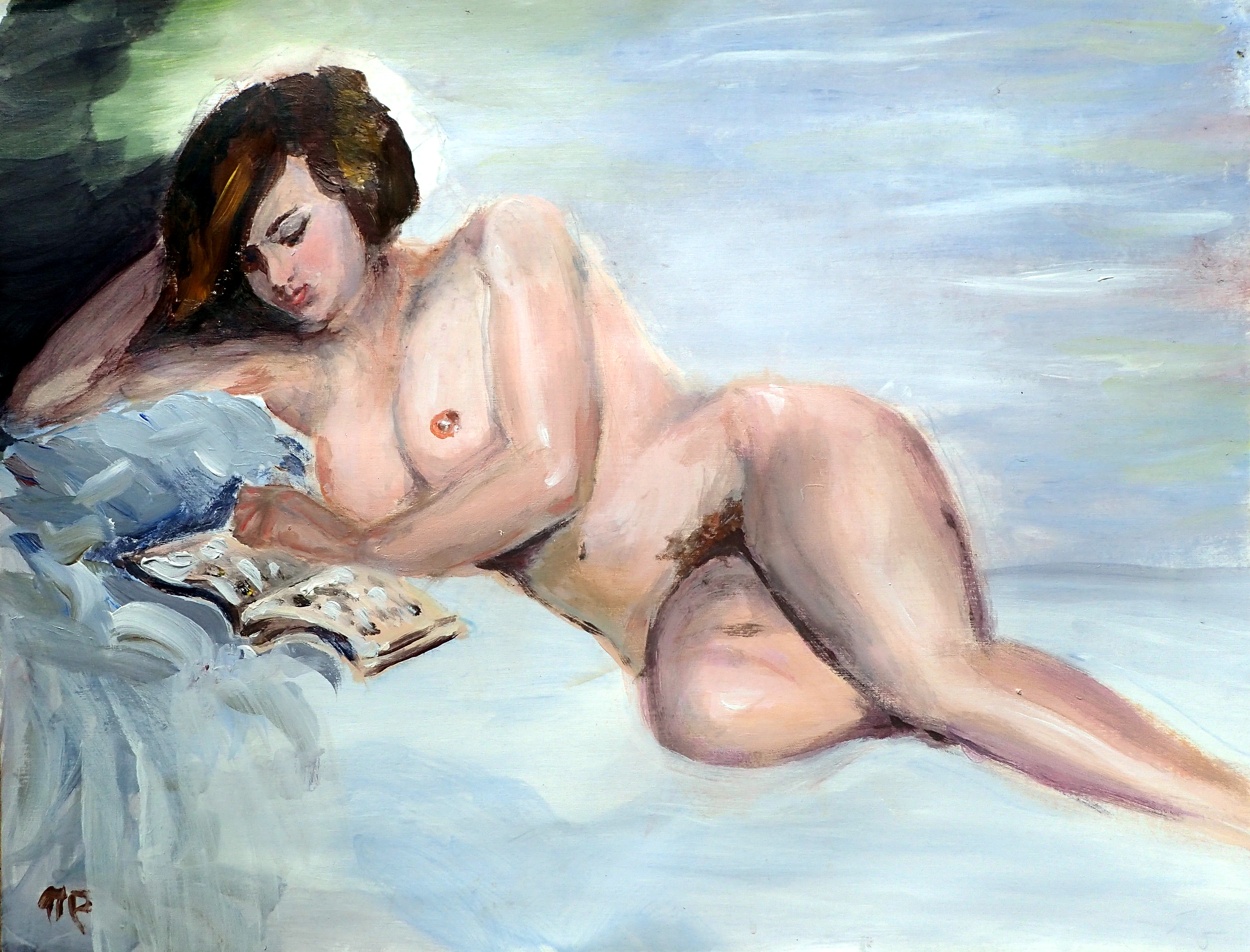
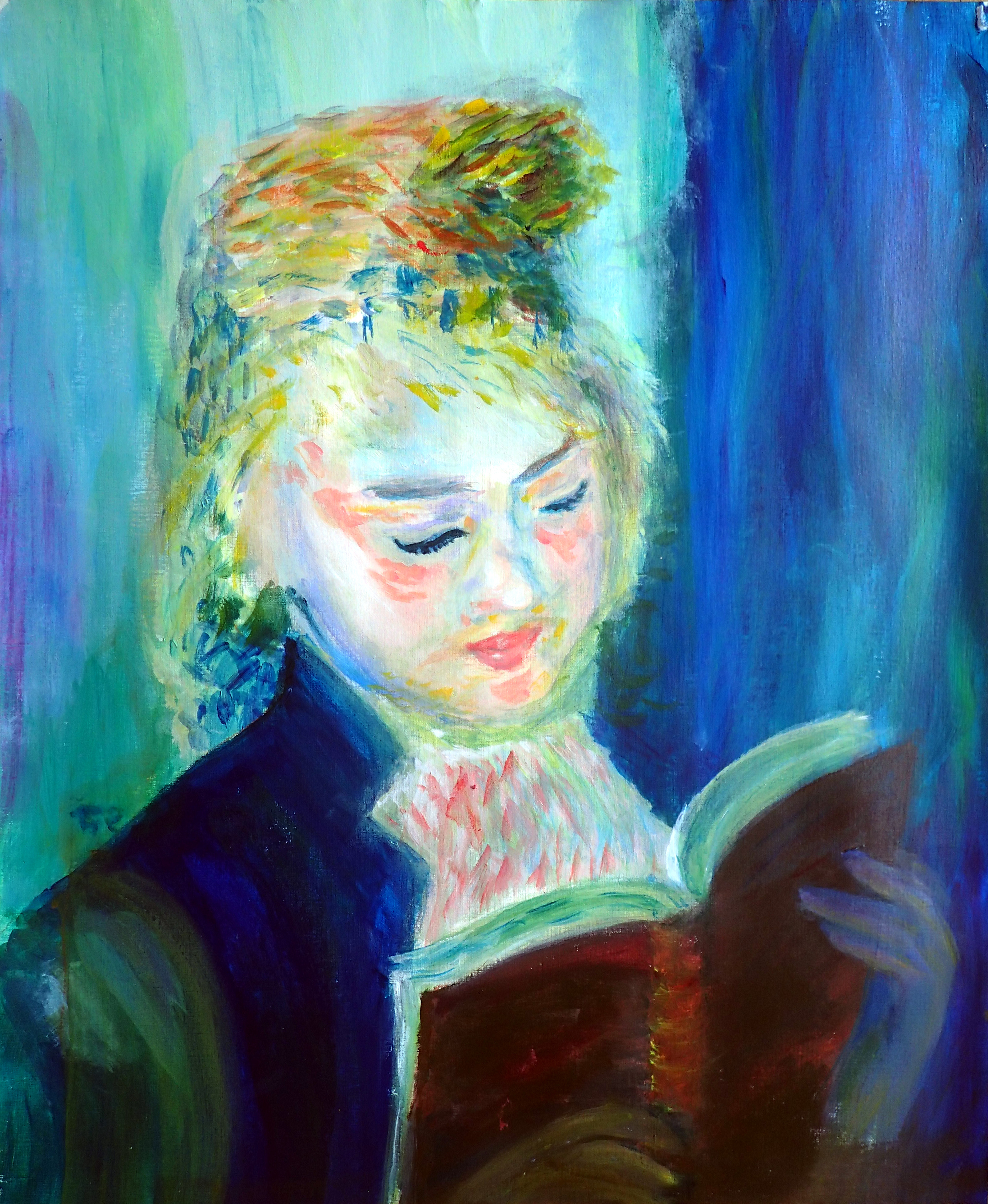
The reference of the first painting, the nude, is nu lisant by Isaac Israëls (near 1900). The reference of the second painting, the portrait, is la liseuse by Auguste Renoir (1876): the original painting could be observed at Orsay museum in Paris. Here is my interpretations of thsese famous paintings with acrylics, as studied at l'ESAD.
Acrylic, 50x65cm.
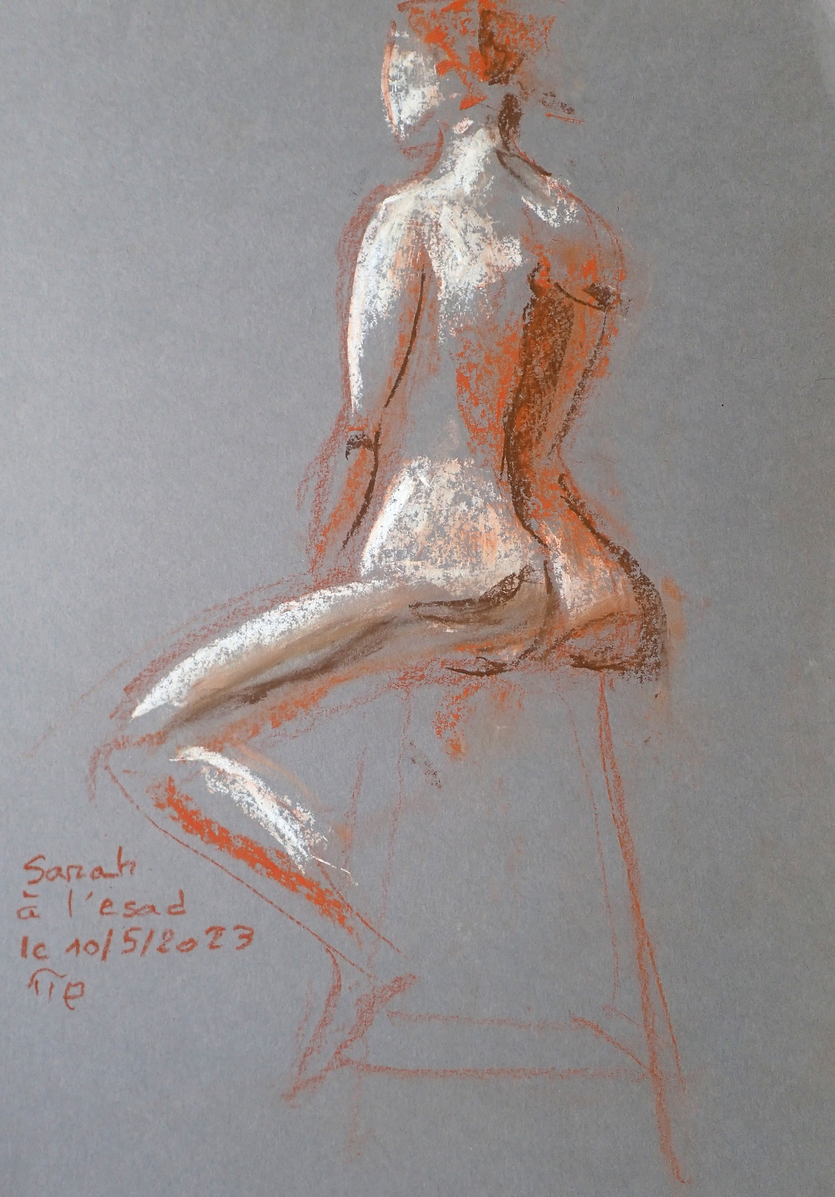
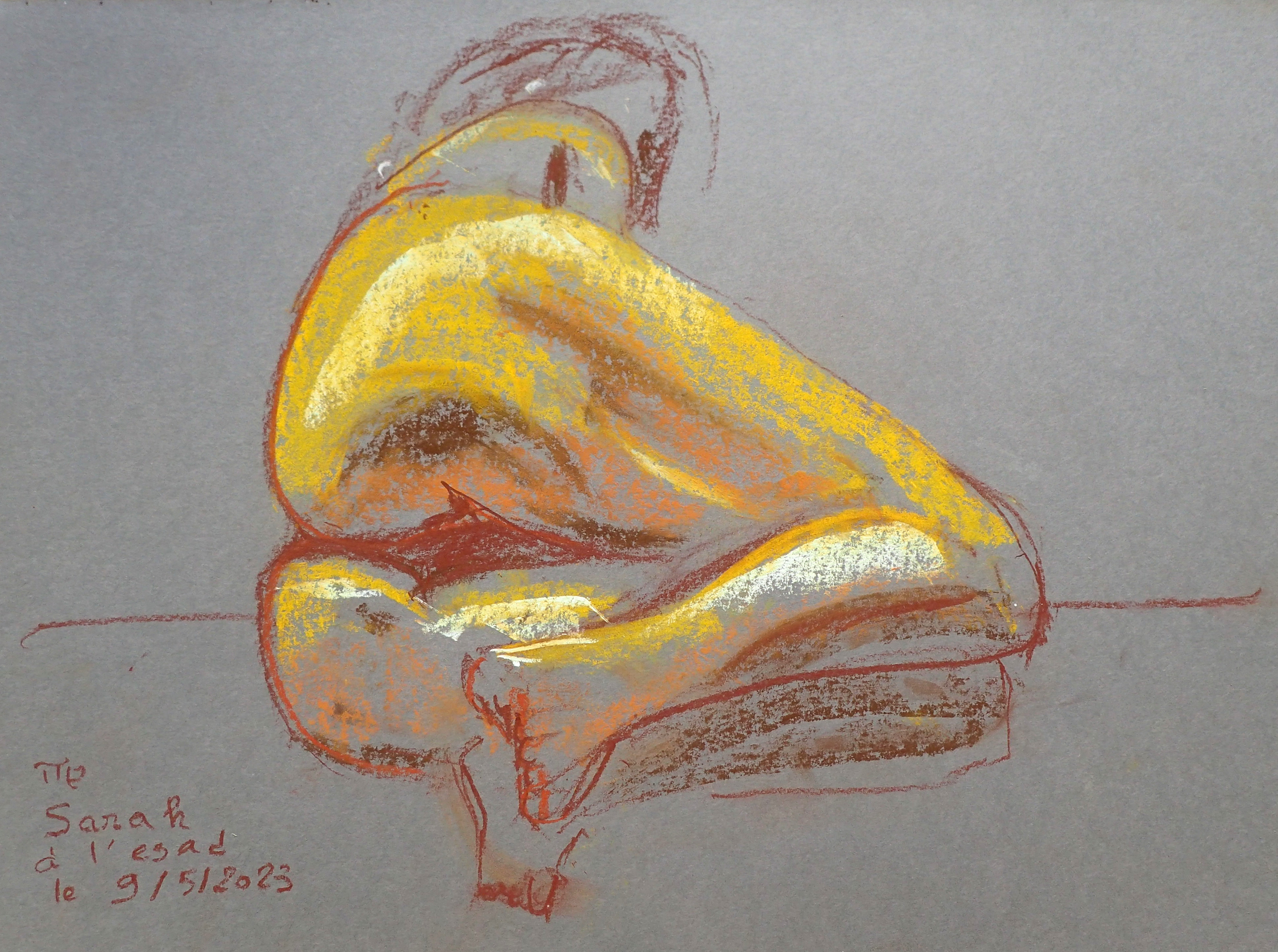
Sarah at l'ESAD. Pastel, about 42x30cm. Life figure sketch, 10mn.
To mix my acrylic colors as I want, I must have a basic and well balanced set of pigments, and I must know what will happen when I mix them together. So, during a long weekend, I decided to paint a color-chart for better understanding and mastering colors. I first defined my palette with twelve colors:
| name | pigment | winsor-newton |
|---|---|---|
| magenta quinacridone | PR122 | 550 |
| red cadium | PR108 | 99 |
| sienne brunt | PR101 | 74 |
| Umber raw | PBr7 | 557 |
| Ocre | PY43 | 744 |
| yellow cadium medium | PY35 | 116 |
| yellow Hansa | PY3 | 346 |
| green phthalo | PG36 | 521 |
| blue cerulean | PB35 | 137 |
| blue phthalo | PB15:3 | 515 |
| blue ultramarine | PB29 | 664 |
In the second column, I indicated the official pigment symbol. The number in the last column is the index in the Winsor Newton acrylic catalog. I then started my first color-chart: I followed the book Alla prima by Richard Schmid, page 130. Note that this book is now feely available for downloading
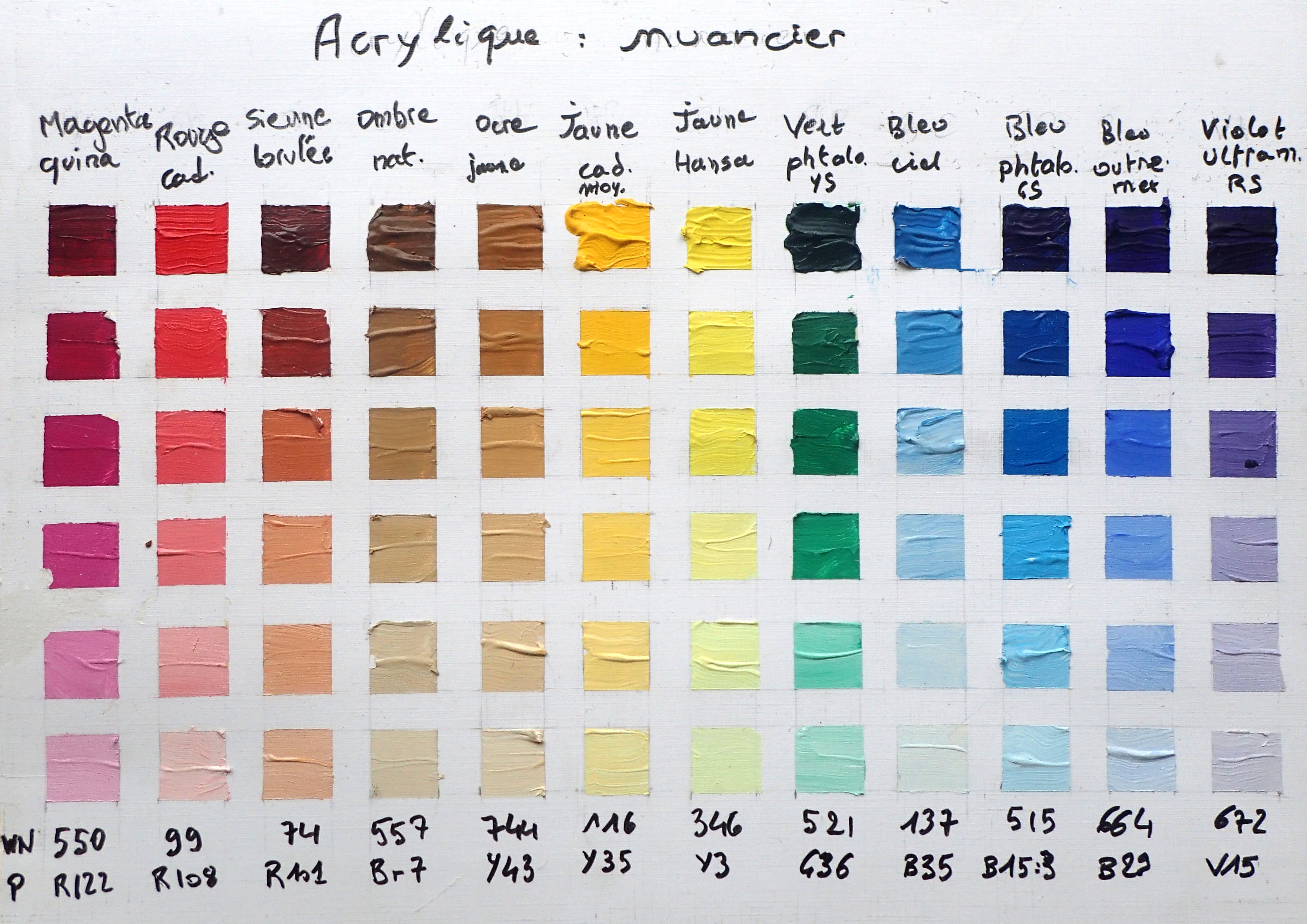
In each column of the color-chart, I first used each color as it came from the rube, and then lightened by adding some titanium white. I first observed that there was redundancies in my first palette: the cerulean blue is very close to the …
Read more: